Saturday, January 21, 2012

It All Started with a Mouse Remastered

It All Started with a Mouse
After taking Digital Coloring and Lettering last quarter I had decided that I would go back into old drawings that I had colored and redo them. I want all of my color pages, covers, and pin-ups to follow all of the technical aspects of Digital Coloring. It All Started with a Mouse was the first to get redone. Aside for the line art there is absolutely no black in this drawing, as it should be.

I had wanted to stay true to the original, but there are some slight changes. There is now a shadow in the forest area, and I added some color holds, but not many. The most obvious color hold is the sun/the Looney Tunes logo, and I would love to know what you think about it. Because the logo was representing the sun for this piece I decided to use the color hold to make it look like it's shining down on them. The other two color holds are the magic from Tinkerbelle's wand and the beeping light on Rosie's head, and the latter is the toughest one to see.

"It's Transparent"

My Kitchen in Two-Point Perspective
I am taking Environments, Props, and Structures this quarter at SCAD-Atlanta, and our first project was to draw two real interiors in two point perspective. We had to draw each interior twice, but at different angles, and so a total of four drawings. This is my kitchen, and it was the first drawing that I did. I thought that it would be the easiest part of the room, but it took me a whole day to finish this drawing. Partly because I did something that it doesn't look like anyone else in my class did...I didn't crop anything, and instead I used the whole 11x17 page to draw this.

I can laugh about this now, but at the time this was being critiqued I really didn't have a sense of humor about it. On Thursday when this was being critiqued my professor, Nolan Woodard asked me what kind of glass is that in the bookcase. I have no idea, still don't, and I told him that, but I added that "it's transparent." It was a moment where I wish that I could just suck those words back into my mouth because of how ridiculous it sounded. "It's Transparent." Thank you, Captain Obvious. I knew that there was some laughter from the class, but honestly, I ignored them since I didn't want to see any raised eyebrows. So I was a bit upset with myself for that ridiculous answer, but thanks to some friends and my mom I can now join in on the laughter. Later I would ask my mom if she knew what type of glass that's in the bookcase without telling her the story, and guess what she said? "It's transparent." 


Another Angle of my Kitchen
I must admit that I got sick of the kitchen after finish this drawing especially the chairs with that diamond shape, but this angle was the reason why I chose the kitchen in the first place. The way the room juts out in the corner makes the room very interesting. When it comes to perspective I am very, very picky. The first constructive criticism that I had ever given on deviantart was about someone's perspective being way off. However, I cannot deny that the one object in this room that jumps out at you is the fan. Fans are murder to draw in perspective, and I had actually drawn a fan in The Doo Family Portrait, but I couldn't work out the perspective on it that I deleted some of the blades in order to make it work. After taking this class I've learned that just because it's a two-point perspective drawing doesn't mean that it only has two vanishing points. It can have more than two. The two-point perspective merely means that an object goes to two vanishing points. I thought maybe I could finally get a fan drawn correctly with this new found knowledge, but it didn't work out. That one blade that was facing me was the one that gave me fits.


My Living Room in Two-Point Perspective
 
By the time I got to work on the living room I had already seen some of the work that my class was doing, and I noticed that they weren't using the whole paper as their picture plane. Instead they had put panel border on theirs. So that's what I decided to do on my living room. Of all the rooms in my house this room has the most character, and it's defining feature is that niche, but this room was challenging because of the furniture arrangement. There were a lot of nonparallel lines that my horizon line was just filled with vanishing points.


Another Angle of my Kitchen
 This was the last of the interior drawings, and each drawing took me a whole day to draw minus the hours I was in class.

Aside from my...ridiculous answer the critique went rather well.

Final Thoughts

I am presently writing two scripts, one for Visual Storytelling I and the other for Environments, and both are the final projects. I have decided to get away from my dark storylines and actually write two lighthearted stories. I don't want to trap myself into being known as the artist who only writes dark stuff. My early works were extremely light, and there were so many lighthearted stories that I got sick of them, which led to writing darker material. It's time to bring that light part of me back out. Both could be considered a slice of life type story. Also I am on my last page of the Vampire Mouse mini comic, and despite having a lot of work to do this quarter I will try to finish that page that way I can get the comic into the post production phase before the deadline for it's release in April. Until next time, this is Billy Wright wishing you all a good night. So long, everybody!

Tuesday, December 20, 2011

The Final Project of Digital Coloring

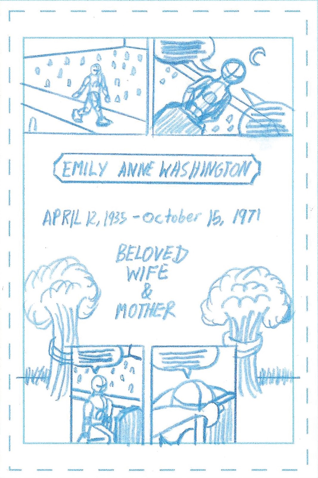
The Sacrifice_Page 1
I was planning on saving this until I fix the second and third projects from Digital Coloring, but since this is the final blog entry of 2011 I decided to forego the original plan. When  I created this blog it was for the sole purpose to show off my art and how I think from thumbnails to the finished piece, but I was a bit secretive when it came to this project. I decided not to post my penciled pages or line art. I wanted the ending to be a complete surprise to everybody. I plan to revisit the pages later and add the suggestions that were made during the critique, but for now here's the original. I am going to talk about each page one-by-one, and so please, if you haven't already, read page 1 before continuing on.


The story starts off with Thomas Washington visiting the grave of his mother. Thomas is a superhero who goes by the name of "the Killer Bee," and he belongs to a group of superheroes known as "The Winged Warriors" alongside the Dragon/Peter Grayson, the Griffin/Jack Ripper, the Dragon-Girl/Erin Banks, the female Painted Bunting/Martha Rudebaker, and Victoria McDonald. He is considered the third in command behind the Dragon and Victoria McDonald, the founding members of the group. This scene takes place shortly after the murder of Victoria McDonald and Peter Grayson's self-imposed exile, leaving Thomas in charge of the group. When I was approaching this story I was writing the origin story of the Killer Bee, which was something that I hadn't yet established. I had stories that talked about his father and his two sisters, but never once did I mention what happened to the mother, and I knew that the death of the mother was going to be what motivated him into fighting the forces of darkness.


When it came time to color this scene I knew that the palette that I wanted needed to be depressing, which meant that I was going to use cold colors such as blue and purple. My main purpose when I approach a story is to pull the audience into the story and primarily through psychological means. I wanted the audience to feel what Thomas was feeling in this scene, and I think that the psychological element works better with this scene alone. I could be wrong. So aside from being depressed Thomas also feels guilty, and I wanted to illustrate that in the coloring, but it really didn't work out, and I wound up getting rid of that idea. I just didn't know what the color of guilt was, and I had two friends who mentioned green (another mentioned brown along with the green). Unfortunately when I colored it I didn't get the depressing, morbid results that I wanted, and that's where turning for help comes in handy. I wanted to keep this storyline a secret, but I was willing to divulge it to a friend or two. Nick Palmer was a huge help in capturing the results that I wanted for this scene. He told me to desaturate the background, and now...it looks downright depressing. Excellent!!! He also told me to darken Thomas' blond hair because it was way too bright, making it seem as though it was a comedy. I did not want anyone thinking that. I don't write comedies.


The story is about the mother's sacrifice, and nothing on this page says that more than the only warm colors in the scene. The bright yellow and red on the flowers were to draw the viewer's eyes to the grave to make that point. Originally, I was going to put down blacks on the sky like I normally do, but I decided not to because I wanted to use a glowing colorhold on the full moon since that was the only light source in the area.


The Sacrifice_Page 2
While page 1 can read pretty well without the lettering, which is something that all comic artists should strive for, this one on the other hand was completely different. The problem that I faced with this scene was that it's an exposition scene, which meant that it only could make sense with lettering. It was unfortunate, but I just couldn't see any other way around it. This scene is a flashback scene, and the original idea was that I would deal with the flashback in the coloring by either desaturating the colors or using a monochromatic palette. Of course, as you can see, I used neither. The present day scene was so desaturated that there wasn't any point to messing with the colors of the flashback scenes. My professor, Nolan Woodard had suggested the wavy borderlines, and that was done in the penciling stage. I decided to go a step further by turning the gutters gray, which kind of gives the scene a memory type feel to it. Though it was a challenge to switch back to present day on the third page.


The Washingtons date back to the 1600s, and in fact, one of Thomas' ancestors was a judge during the Salem Witch Trials. Jasmine Cartwright and her friends were falsely accused of being witches, and since they refused to confess they were executed, but Jasmine was able to break free and flee into the woods. She wanted revenge against them all, and so if the people of Salem thought that she was a witch then a witch she shall become. She made a deal with the devil and was infused with dark magic and immortality on the condition that she kill her accusers and their ancestors. The Washingtons were her last target, and she infused Thomas' mother with unstable dark magic that would cause Emily Washington to eventually explode and take out a large number of the population. So that's the background story for this scene. Mr. Washington wants to save his wife's life, but the doctor, who by the way was named Dr. Schweizer in the script, told him the bad news. The interesting fact about this scene was that I was having trouble writing it until I came up with the name for the doctor. I am known for putting names of people I know into my stories, and usually I combine two names to make one person. So for example, in the final script that I did for Comic Book Scripting-which was actually riddled with familiar names-I took friends Lisa Tolbert and RJ Thompson to create Lisa Thompson. Here, I just used the last name. During a Scripting class Prof. Chris Schweizer mentioned that he was considering going back to school to get his doctrine that way he would be called Dr. Schweizer. I was thinking about that one morning while I was having breakfast, and I came up with the idea for this page. It's a shame, however, that the name can only be seen in the script.


Please take careful notice that there's a gun on the counter in the second panel because it winds up coming into play later, and I'll talk about it then. As for the palette, I wanted a classroom look, and so I looked up classroom palettes to get the right colors. After having to hear the term rainbow palette described in my past projects I was determined not to hear it again that I asked Melody Ledford for her opinion, and unfortunately, I had a STINKIN' RAINBOW. So after I spoke with her I wrote up a color palette list for each scene, which helped immensely. Let's just say that during my final critique the term rainbow palette was never uttered. Boo-Yah!


The Sacrifice_Page 3
This was the most difficult page of the story, and it was the page that Nolan wasn't sure how I would pull it off based on how much information was in it. It's also where I return to what was so great about the first page in which it could survive without the lettering. It was this page that wanted me to keep the story a secret because of the shear shock value of it. The fewer who knew how it ended, the more shocking it would be when I unveiled it. That's why only three people knew the end. A great majority of superheroes or even heroes in general are created through tragedy, but most of them, perhaps all of them, were created because of the actions of a thug. For the origin story of the Killer Bee I decided to turn the traditional origin story upside down by having Thomas as the one who killed his mother. Although he was the one who had pulled the trigger the reason why this moment drives him to fight against the forces of darkness is his hope that he will come face to face with the witch who started it all. Perhaps he's hoping for redemption as well.
The top tier was the toughest because of how much information was contained in such a small panel, and the third panel was absolute murder. The problem is that my characters tend to talk a lot, and I usually joke that it's to make up for how little I talk. People want me to talk more, but they want my characters to shut up. However, I was able to make the third panel work when I decided to cut what was supposed to be a one balloon into two balloons. The brilliant part about that was that it also directs the eye to the gun, which is framed by the balloons. Perfect!

If you go back to the blog entry that featured the thumbnails you might notice that there wasn't a gun on the counter in page 2, and the reason was that it occurred to me a question may rise when Thomas pulls that gun out of his pocket in page 3. How did he get a gun? I decided to initiate what is called "Chekhov's Gun," which means that you introduce an object like a gun in a scene that it is irrelevant in, but only to have it come back in a big way later in the story. Prof. Schweizer also referred to it as "Chekhov's Boomerang." So in page 2 you see the gun on the counter in the second panel, but it disappears in the final panel along with Thomas. Now the only question that remains for the audience is why did Thomas decide to kill his mother himself instead of letting his father do it as was planned? The answer is very clear, love. He loved his father that he couldn't allow his father to carry around that guilt. Also, there is no stronger bond than a mother and a son. The story is called The Sacrifice not just for the sacrifice that his mother makes, but also for the sacrifice that Thomas makes. He sacrificed himself that day. He knew that he would carry around that guilt til his dying day, but he chose to do it anyway. As the final panel says, "Sometimes sacrifices must be made for the greater good."  

SCAD Scholarship Gala


It All Started with a Mouse
I never get tired of showing this piece off. I have a SCAD scholarship, and I was asked recently to donate an exceptional piece of art to the SCAD Scholarship Gala that will be held in February at the newly built SCAD Museum in Savannah, Georgia. They didn't specify whether it needed to be an exceptional piece done for a SCAD project or not, and there have been some projects that I've been proud of, but nothing tops this. So I finally got around to printing it out, and it's being framed as we speak...well, not literally as we speak. I always thought that the Vampire Mouse mini comic would be my first sale, but it looks like this will be. I'll be interested to know what it goes for because I never could figure out a good price for it. It is essentially three 17x11s, and judging by the cost for an individual 17x11 it would be $20, making this $60. However, it could very well be higher than that.

By the way, call me crazy, and please do because I would be highly disappointed if you didn't unless you're a perfectionist, like me. I am actually redoing It All Started with a Mouse because the original was done before the Digital Coloring class, and I am redoing it to add everything I learned from the class such the flats, making sure that the anti-alias is turned off, backing my blacks, and using K-free colors. It shouldn't look that different, but I'll post it when it's done.

Sad Days in the Comic Book World

I would like to acknowledge the passing of two comic book legends this past week. Jerry Robinson, who worked alongside Bob Kane and Bill Finger in the early days of Batman, died on December 7th at the age of 89. He is credited for creating Robin, and it's up in the air whether or not he created the Joker or not. He also worked alongside Neal Adams to help Jerry Siegel and Joe Shuster to regain their recognition to the creation of Superman.

Joe Simon, who co-created Captain America alongside Jack Kirby, died on December 14th at the age of 90. Aside from creating the legendary superhero he and Kirby also created the first romance comic called Young Romance. The team of Simon and Kirby also created the superhero the Fly.

These two will be sorely missed.

Final Thoughts


As I said earlier, this is the last blog entry of 2011, and I look forward to the new year. There's just so much art that is still left to be created. So...


Aside from that I hope that you have Happy New Year! Until 2012, this is Billy Wright, wishing you all a good night. So long, everybody!

Sunday, December 4, 2011

The Doo Family Portrait

The Doo Family Portrait
Here it is! The Doo Family Portrait, featuring every member of the Doo family that ever appeared in a Scooby-Doo episode.  This is also the last of the projects that I had been working on during the summer except for the mini comic.  Some of these characters are so minor that many of you may not know who they are, and so let me introduce you to everybody.

Front row, from left to right: Howdy Doo, Scooby's brother; Ruby Doo, Scooby's sister and Scrappy's mother; Scrappy Doo; Yabba Doo, Scooby's brother; Scooby Doo; Momsy Doo, Scooby's mother; Dada Doo, Scooby's father; and Grandpa Scooby.

Middle row, from left to right: Skippy Doo, Scooby's brother; Scooby Dee, Scooby's cousin; Scooby Dum, Scooby's cousin; Whoopsy Doo, Scooby's cousin; Dixie Doo, Scooby's cousin; Dooby Dooby Doo, Scooby's cousin; and Horton Doo, Scooby's uncle.

Back row, from left to right: Great-Grandpa Scooby and Yankee Doodle Doo, the first Doo in America.

I said this once before, but it bears repeating. This idea sprang from something that a friend of mine had said regarding my drawing It All Started with a Mouse. When I had made the mention on Facebook that I had just finished drawing Scooby-Dum, the least remembered character of Scooby Doo, in the panoramic drawing she said that I should add Scooby Dee and perhaps Horton Doo. Of course, I didn't have any room in the composition for more characters, but through that suggestion came The Doo Family Portrait. 

Since it took me a long time to finish The Incredible Hulk Transformation it allowed me to go through the entire Digital Coloring class thinking about this portrait. I am not kidding when I say that through each assignment that we had excluding our three original pages I was constantly thinking how I could apply the new technique that we learned in a given lesson to Scooby Doo and his family. I was seriously thinking about adding cuts to this drawing since they would be animated style cuts, and I thought that that would be perfect for a portrait based on a cartoon. However, I decided against it because shadows and highlights were not that prevalent in the classic cartoon, and I suppose that I could've added cast shadows, but I didn't. Instead I chose to just use basic color. Speaking of color, I probably have a rainbow palette, but...I just don't care. I wanted to stay true to the characters' color palette that it didn't matter if I ended up with a rainbow. 

This had to be the most fun drawing that I've done since the last time I brought a large assortment of cartoon characters together. Still, it provided some challenges such as Howdy and Skippy Doo. Their only appearance was in A Pup Named Scooby Doo, and they were both puppies, which meant that I had to age them to Scooby's age. Fortunately the three brothers are triplets, which helped the aging process. Strangely, and I have no explanation for this, but Horton Doo should've been aged too since he also appeared in A Pup Named Scooby Doo. I just didn't do it.

I mentioned already that I wanted to stay true to the characters' color palette, but in the case of Great-Grandpa Scooby, I deviated. I stayed true to his blue-gray palette, but he just didn't look that ghostly. In fact, in the one episode that he appeared in he WASN'T that ghostly. Sure he was bluish gray and transparent, and that certainly would have worked if I had put something on the wall to make him look transparent, but I didn't in fear that it would take away from the portrait of Yankee Doodle Doo on the right side. I thought maybe making him look like he's coming through the wall would help, but truth be told, he looked like he was a wall mount. This is where waiting until my Digital Coloring class was over to finish this project came in handy because it allowed me to learn how to do a color hold and make it look like it's glowing. The best color holds are used on intangible objects, and ghosts would definitely fall in that category unless they're solid, but that's a question for another time. So I would have to say that Great-Grandpa Scooby is my favorite of this composition because of his ghostly look.

I hope that you all like it.

Mini Comic Update


I am continuing my work on the Vampire Mouse mini comic, which is due out in April of 2012 at the Fluke Mini Comic Festival. I have just finished penciling page 10, and I am going pretty fast that there's a chance that I could be finished by the start of the Winter Quarter. That would be GREAT.

I had shown you Page 1 already, and so here's pages 2 and 3. As you can see they're still in the production stage since I haven't gotten rid of the blue line yet or even cropped them to the bleed. Also I haven't done the suggestions that Prof. Chris Schweizer had made, which I probably won't do until all fifteen pages are complete.

I had put the mini comic aside when the Fall Quarter began, and then I picked it up where I had left off as soon as the quarter ended. Normally that would be just fine, but I discovered that I had made a continuity mistake. In the first six pages of the comic that were done before the Fall Quarter the mice have five fingers, but in pages 7-10 that were done after the quarter the mice have four. It's a major mistake, but truthfully, the pages done after the quarter are correct based upon the original character design. The Vampire Mouse was designed with four fingers, not five. So how did he come to have five fingers, not only in this project, but also in The Vampire Mouse Transformation Animation? Answer: I tend to take a picture of myself in the pose that I want to draw, which really helps in drawing hands, but in this case, I forgot to ignore one finger. What a mistake, but one that I will not correct. First of all, I don't know how many people will actually notice, and second, it adds a little bit of speciality to the first installment of the origin story.

Vocabulary Correction

Speaking of errors, I have a slight correction to make. I had said in my last post about the Modern Masters Exhibit at the High Museum that Abagael Warnars had wanted the members of the Atlanta Art History Society to choose a modern master and write a "non-fiction" story about them, and then we were going to hand them to our club advisor, Dr. Jasin. What I meant to say was that we were supposed to write a FICTION story about a modern master. I get "fiction" and "non-fiction" confused sometimes, and I meant to double check it, but instead I decided to do something that's not really me...be confident that I was right. Of course, I was wrong. I'm sorry about that confusion.

Final Thoughts

Before I head back to inking Page 10 of the mini comic I want to announce some drawings that are in the planning stages. The most important one is The Captains of Heroism, which will feature Captain America, Captain Atom, Captain Planet, Captain Marvel, and one more captain whose identity will not be divulged yet. A Dick Tracy drawing featuring some of his most notable rogues gallery. Of course, the two panoramic drawings of The Heroes of the Marvel and DC Universe and The Villains of the Marvel and DC Universe.

So until next time, this is Billy Wright wishing you all a good night. So long, everybody.     

Sunday, November 20, 2011

Finally! Here's the Hulk!

The Incredible Hulk Transformation_Color
Okay, I admit it. It has been a while since I have posted anything, but like I had said in an earlier post, there's a lot to look forward to in the coming days. So here it is! The Incredible Hulk Transformation! It took me quite a long time to finish this one, and it had nothing to do with the amount of school work I had although that did play a small factor, but primarily I wasn't happy with the original cuts that I wound up starting all the way back to the beginning. Before I go any farther, for those of you who are unfamiliar with the term "cuts" it means shadows and highlights on the figures. There are two types of cuts: soft and animated style. Soft cuts are what you would tend to see in superhero comics, and that would be more ideal to this Hulk drawing, but I don't know how to do soft cuts since that's taught in the Advanced Digital Coloring class. Instead I used the animated style, which technically would fit my "big foot" drawing style anyway. So I wasn't happy with my first set of cuts, and since I had forgotten to place the cuts on separate layers I had to start over. Thankfully I still had the flats. Another colorist term, "flats" are the first thing that you have to do when you start a coloring project. You delineate each shape with basic color, and although I didn't when I first started the Digital Coloring class I now try to use basic colors that will be close to the final color. Not only will flatting make it easier to color, but if a problem arises at any point you can easily start over because you still have your flats...unless the problem occurred in the flats, which I have had happen once, and take it from me, it's not a very good feeling to have to redo the flats. It's also the slowest part of the coloring process, but I am getting faster at it.

Although the Hulk is clearly the dominant figure in this drawing I find that it is more about the tortured soul within Bruce Banner. I am a huge fan of the 70s Hulk television show with Bill Bixby, and even though this Hulk is definitely of recent comics I was thinking more about Bixby when I was doing Banner. It may look nothing like Bixby, but I wanted the turmoil that Bill Bixby brought to Banner in the show. In homage to the show, if you look very closely at Dr. Banner's eyes, they're bright green.

Originally the background was just supposed to be bright red, but then I got this idea to have a progression from dark red to bright red to show the growing rage within Banner. By the time the red reaches its purest, brightest form, the Hulk appears, and the transformation is complete.

Fear Agent

Fear Agent
There are five artistic jobs in the comic book industry: a writer, a penciller, an inker, a letterer, and a colorist. A colorist has to color other people's work, and this cover of Fear Agent by Chris Samnee was the first time that I had ever colored work that wasn't my own. It was a new experience for me. This was our first project in the Digital Coloring class, and frankly, I got so sick of this cover because of how many times I had to work on it. It became pretty clear after this project that I was going to have a coloring problem. The problem was how many colors I tended to use in my palette. In three straight critiques I was told that I had a rainbow palette, and in the case of the third critique, I was trying to stay more aware of the colors that I was using to make sure that I didn't have a rainbow. Finally, I just decided to ask my professor, Nolan Woodard how many colors should be in a palette. He told me that there really isn't a set number, but it is best to have four to five colors, and the fifth should be the one that really pops. Armed with that knowledge aided me to fixing Fear Agent and resubmit it.

As you can tell, there weren't any cuts used for this project. The goal was to use flat color and temperature to make Fear Agent pop off that page. I had resubmitted this originally at midterms, but Nolan thought that I could do better, and he chose not to count it. He gave me another chance at resubmitting it. I worked on it again, but this time, I decided to go around to different people in the Sequential Art Department and ask for their opinion. I made the necessary changes that they recommended, and this was the final result. However, I have no idea yet what Nolan thought of it.

By the way, Nolan Woodard was the colorist for the actual cover.

The Modern Masters

I have been to the High Museum of Art in Atlanta  for several exhibitions such as the Terracotta Army, the Leonardo Exhibit-after taking Dr. Jasin's Western Art II class I refuse to call it the Da Vinci Exhibit-and Monet's Water Lilies, but the Modern Masters exhibit had to be the best of the bunch. I went there on the opening day of the exhibit in October along with Abagael Warnars, Lisa Tolbert, and Melody Ledford as members of the Atlanta Art History Society. It featured the works of Henri Matisse, Pablo Picasso, Marcel Duchamp, Jackson Pollock, Andy Warhol, and many other 20th Century artists. I am not the biggest fan of 20th Century art except for architecture and sculptures, but it was a blast. I finally got to see a Jackson Pollock painting in person, and frankly, I still have the same opinion of him. When it comes to Pollock's drips I can only think of a line from a Top Cat episode where TC sees a painting at an art museum that the curator was raving about, and when asked if he sees what the painting is saying Top Cat replies, "It says don't drink while you're painting."   

Marcel Duchamp...what can I say about him? He was a very bizarre individual whether it was buying someone else's work and simply adding something to it to make it his own artwork or taking a urinal and lying it on its back before entering it in an art exhibition. However, he did inspire me. Abby had made the mention to me that we were going to pick one of the artists and write a non-fiction story about them, and then we were going to send it to our club adviser, Dr. Jasin. Lisa wanted to write about how Pollock was a murderer, and since I came up at the end of her talking about it I can only surmise that Pollock's drips are actually blood splatter from his murders. I thought that it was a joke, but it wasn't. So I came up with an idea for a short story about Marcel Duchamp called The Man with Two Minds, and it had to be the best short story that I've ever written. As far as I know, however, it was never given to Dr. Jasin.

I enjoyed seeing Matisse's work, which I knew that I would since he was one of the few 20th Century artists that I like although I am not a huge fan of the biggest Matisse painting that the museum had, Dance, but they did have other pieces of his that I did like. I also loved the sculptures of Constantin Brancusi. So I would highly recommend that you go to this exhibit if you're in the Atlanta area, and you don't have to be in love with art history like me to enjoy it.

Final Thoughts

The Fall Quarter of 2011 is over, and now it is time to return to working on projects that I had put on hold such as the Vampire Mouse mini comic. I have just finished flatting The Doo Family Portrait, and so I will be starting on the coloring very soon. I am also reworking two projects from Digital Coloring even though I can't resubmit them now, and so it's more for my own benefit such as putting them into my newly created color portfolio.

Since I won't be posting again in this upcoming week I want to wish you and your family a Happy Thanksgiving!

Until next time, this is Billy Wright wishing you all a good night. So long, everybody! 

Sunday, October 23, 2011

The Sacrifice


These are the thumbnails for a three page comic for my Digital Coloring and Lettering class. We are going to pencil, ink, color, and letter our pages for our final project of the quarter. My story is called "The Sacrifice," and it is basically a framed narration, a term that I've recently learned in my Comic Book Scripting class. A framed narration is a story within a story, and so in this case, the first story is about the protagonist visiting a grave in a present day cemetery, then he has a flashback, which is the second story.

Like most of my stories, it will not end happily. Do not expect to be cheered up when you read it. It's purpose is to tug at the reader's emotions, and if the first page, which I've finished penciling already, doesn't do that then nothing will. Although this story talks about the ultimate sacrifice it can actually be considered a parable for any sacrifice that one has to make in their lives for the greater good. 

Theft and Defacing


I had created three poster designs for the SCAD-Atlanta Animation Society to advertise for their meetings this quarter, and I printed out two for each design and posted them around SCAD-Atlanta. I had heard stories about theft at the school such as laptops, but unless the thief broke into someone's locker it was all due to carelessness. I may be extremely trusting, but I wouldn't leave a laptop laying around somewhere. I didn't think that I had anything to worry about since we are all art students at SCAD-Atlanta, and I figured that we would respect each other's art; we don't have to necessarily like it, but we would respect it. Well, there's my naivety shining through.

On the morning of Thursday, October 20, 2011 I had just come out of Comic Book Scripting when I happened to glance over towards the women's bathroom on the 3rd Floor of the main building to check on the first poster shown above, like I normally do when I come out of class. However, this time it was gone. There was another poster in its place, and the real kicker is that this poster was hanging right next to its duplicate. You don't need to hang two posters for the same event right next to each other! That's overkill! The theory is that that bulletin board doesn't have any spare tacks, and so they took mine, the ones that I bought, to hang this poster. They either threw away my poster or...there's a chance that they hung their poster over mine, and so maybe once that event has passed it will appear again unless of course, some individual discovers it himself beforehand.

I was ticked off about the theft, but it was nothing compared to the anger that awaited me at the DMC. After I finished my Digital Coloring project that was due that day I went around to each poster location to make sure that they were still there, and they were, which I was glad about. In order to put a poster up at the school you need to get it confirmed and stamped with the seal of approval, and I had. This seal of approval mentions that the date that the posters need to come down is November 16th, and while I was at the 3rd floor of the DMC I was examining the second poster shown above to make sure that the seal had that date. During my examination I discovered that someone had drawn a tiny tongue on Norman's face, making it look like he was sticking his tongue out at everybody. There is no way to describe the anger that I felt to seeing that vandalism, and neither can I describe the depression and discouragement that followed. I have worked hard to help the Animation Society get the word out that they exist, and someone has basically just spit in my face. This is the type of behavior that I would expect from the thugs in Watson's Grove, my neighborhood, not SCAD. 

Like I said, I would think that art students would have more respect for each other's art than what I just discovered. I began to question whether all of the work that I've put into the Animation Society was really worth it. However, after hearing from three friends of mine I have decided that the work is worth it no matter how discouraging it can get when one runs into a couple of bad eggs. I know one thing that I won't feel better until I get back to school and rip that defaced poster off the wall and replace it.

Final Thoughts

I need to get back to work on writing a script that's due on Tuesday. I am hoping to have the Hulk drawing completed by the end of the week, and I say "hope" because I've already started the coloring over once. Thank goodness for flats that make it easier to start digital coloring over.

On Wednesday I will be writing about my recent trip to the High Museum for the 14 Modern Masters Exhibition. So until then, this is Billy Wright wishing you all a good night. So long, everybody. 

Saturday, October 1, 2011

The Message Within

I'm sorry that it has been a while since I've uploaded any artwork. This is the first page of the mini comic that I have been working on for several weeks. It is based on the character that I had created for my Intro. to Sequential Art class in the Spring Quarter of 2009 called the Vampire Mouse.  I absolutely loved the character that he has appeared  several different times in various artwork, but as much as I loved the character I never established what his origin story was, which is completely unlike me. My characters, main and supporting, all have a past and a future that way I know where they've been and I know where they're going, which will aid me in figuring out both their personalities and motivation, but also the stories. Instead with the Vampire Mouse, I created just his future; I couldn't figure out a proper origin for the character.

During the Spring Quarter of 2011 I decided to make my first mini comic, which I plan to sell at the Fluke Mini Comic Festival in Athens, Georgia next year. I felt that it was finally time to create the origin story for the Vampire Mouse, but...I still didn't have a single idea for what would it be. It wasn't until I was watching an episode of Scooby Doo Mystery Incorporated that I was finally struck with an idea. The origin story would be a two part story that would be based on true events except for the vampire part. I won't reveal what it is until it premieres in April 2012, but the first part tells the true story of what happened to me while the second part is metaphorical, and together they contain a message and question for the audience. The great thing is that the message is so hidden within the story that the reader doesn't know that they've seen it or that I've asked them a question. If I've done my job correctly, the reader will automatically think about the question without knowing that THAT was the whole point of the story. It's all about psychology. And even if they don't see anything in what I'm saying, they still have a great story to entertain them.
The drawing above is the first page of The Vampire Mouse #1 The Cost of Love...or is it The Price of Love? It's tough to remember since it has held both titles at one time and one got changed to the other. Vincent Welles has already gotten bitten by the vampire, and he thinks about the events that led to him having two puncture wounds in his neck. So the first part is primarily in flashback. I've finished six pages so far, and I hope to get started on the seventh page very soon.

Final Thoughts

The 2011-2012 academic year at SCAD-Atlanta is in full swing, and it is going great so far aside from making a mistake in one of my projects recently that has set me back to the beginning. Fortunately I have rectified it, and so I am back on course on the two page coloring project for the Digital Coloring class. 

I hope to have the Incredible Hulk drawing done soon, and I'll have some thumbnails for the final Digital Coloring project  to post in coming days. So a bunch of things for all of you to look forward to. So until next time, this is Billy Wright wishing you all a good night. So long, everybody! 

Tuesday, September 6, 2011

Dragon Con 2011

Dragon Con was this Labor Day weekend in Atlanta, and for those of you who don't know, Dragon Con is the biggest pop culture convention in the South. It is held in five hotels: The Shearton, the Hyatt Regency, the Hilton, the Marriott Marquis, and the Westin. It brings together celebrities and artists to meet their fans, and it also brings together some very passionate people, who show their passion by dressing up in a costume. Actually I think that's why some people go to the conventions just to dress up and get attention for it, not that there's anything wrong with that, it's just not my cup of tea. There's no way I will ever dress up for a convention...unless I'm with a group of friends who are dressing up then I might do it just to blend in with them. This was my third straight Dragon Con, and the thing is my objective when I go to any convention is to meet some celebrities whether they're from Star Wars, Buffy the Vampire Slayer, or Smallville and some artists especially the latter. Networking is very important for an up and coming artist. As Fred Flintstone once said, "It ain't what you know, but who you know," and that is very true for an artist. If you meet an already established artist they may be able to give you some pointers or, in some cases, they may help you get through the door. Unfortunately, I have never been able to really network with a fellow artist properly...until the end of this Dragon Con, but I'll get to that later. I have met some great artists at conventions such as Neal Adams and Marvel colorist, Laura Martin, and since I have a love for both penciling and coloring I could've picked their brains for hours, but did I really network with them? No. There's still so much for me to learn in that area.


Dragon Con began on Friday, September 2nd, but I never go on the first day, and instead I chose to go on Saturday, September 3rd. I got there early since I learned that Tom Felton, who played Draco Malfoy in the Harry Potter movies, was going to be speaking at a panel at 11:30 AM, and as a new Harry Potter fan I really wanted to go to that. Unfortunately, when I reached the Sheraton, where we had to purchase tickets for the convention, the line was extremely long, and in fact, it wrapped around the entire hotel. Well, Saturday is probably the busiest day for Dragon Con. The line, however, was moving at a quick pace, but it wasn't quick enough, and I wound up missing Tom Felton speak. Though I did take some consolation in knowing that he was going to speak on Sunday, too.


By the time I finally got my badge for the three days at Dragon Con I really couldn't walk around and take in the atmosphere because the next panel was 1 PM, and so there was no time to waste. The Smallville panel was held at the Hyatt Regency, and I arrived just in time to get a pretty good seat three rows from the front. The panel featured James Marsters (Brainiac), Sam Witwer (Doomsday), Laura Vandervoort (Supergirl), and Michael Rosenbaum (Lex Luthor), and it was called "Three Bad Guys and a Supergirl." Of all the panels that I attended during Dragon Con, this had to be my favorite. They were extremely friendly, and that showed when one fan asked them for each of their nameplates. They not only gave him the nameplate, but they also signed it as well.


Smallville cast


Laura Vandervoort


James Marsters


Sam Witwer


Michael Rosenbaum
 I also attended the No Ordinary Family panel, which featured Julie Benz and Autumn Reeser, and I learned that the show had been cancelled. That really sucked. Congratulations to the television executives who have pretty much given me a reason not watch television since they keep cancelling everything I like aside from Smallville, which left on its own. While we were waiting for the panel to begin I overheard someone say that the show would have done better if it didn't have "no" in its title, which I think is a load of hooey, but who am I say.


Julie Benz
My final panel on Saturday was with the cast of Back to the Future: Lea Thompson (Lorraine Baines McFly), Christopher Lloyd (Doc Brown), and James Tolkan (Mr. Strickland). Unfortunately I don't have any pictures of this since the Westin ballroom was packed, and I was all the way in the back that my shots would have been terrible. I tried a couple of times, but every time I got a chance to do a shot, someone's head got in the way that I wound up giving up. Even though I was in the back and could barely see them it was a great panel.


After the panel, I hurried over to the Hilton to try to meet some of the cast of Smallville, and the goal was, of course, Michael Rosenbaum. I am happy to say that I got to meet him and shake his hand, and I also got his autograph. Boo-yah! I had him sign what I had used as a photo reference to a drawing that I had done of my character Peter Grayson in Materials and Techniques. It shows Lex looking down at the body of Lionel Luthor, who he had just killed, and it was an awesome shot, perfect for a photo reference. Although I was unable to see him speak that day, I also met Tom Felton, and he signed my Harry Potter and the Half Blood Prince book, rather personally too. Both Rosenbaum and Felton may play villains, but they are extremely nice in person. The final person I met was Laura Vandervoort, and like Felton, she personalized her autograph for me. So Saturday was a great day.


Tom Felton and Stan Lee


I had Sunday, September 4th totally mapped out that I would go to the Tom Felton panel at 11:30 AM, and then I would search for Stan Lee and Carrie Fisher, who were somewhere in the Hilton. Once I had met them both I would head down to the Comics Alley in the Hyatt Regency and meet legendary artist Jim Steranko, and I would pay a visit to my Sequential professor, Chris Schweizer. That should take me up to the Michael Rosenbaum panel at 4 PM. As Robert Burns once said, "The best laid schemes of mice and men oft go awry, And leave us nothing but grief and pain, For promised joy!" When I arrived at the Hyatt for the Tom Felton panel I saw that the line extended outside the hotel, and in fact, it wrapped around the hotel that it took me quite a while to find the end of it. There were so many people wanting to get into this panel that the room that it was held in reached full capacity, and the rest of us weren't allowed in, including myself. So just like that, my schedule was thrown off because I did not foresee this at all. It was 11:30, and so I had to begin my search for Stan Lee and Carrie Fisher early, which wouldn't be that bad, but it did mean that at some point I was going to have a time slot where I did nothing. As for Tom Felton, good thing I got to meet him the day before.


It didn't take me that long to find Stan Lee since I just followed the map, and it led me straight to the room where he was signing autographs. Most celebrities charge for their signatures-Michael Rosenbaum was $20, Tom Felton was $40, and Laura Vandervoort was $30. After getting John Schneider and Peter Mayhew's autographs in Dragon Con 2009 and Neal Adams' in 2010 I was used to the $20 signatures, and so Felton's threw me for a loop. So Stan Lee could be anything, but hopefully it was something that I had in my wallet. It cost $55, and in the end, I am glad that I met him because that may have been my final chance although I wish that I could have gotten a handshake out of it to really get my money's worth. Unfortunately I had to sacrifice both Carrie Fisher and Jim Steranko, and that's going to be a bitter pill for me to swallow for a while. After Stan Lee, I only had forty dollars left, and one twenty had to be held back to get out of the Hilton parking garage. It's possible that Steranko would have just been a twenty, but I don't know. I chose instead to use the other twenty to buy Chris Schweizer's Crogan's March, and that turned out to be a good decision because he was sold out of the graphic novel by Monday. Steranko was nowhere to found on Labor Day.


I've already stated this to my friends in hopes that they will call me out on it if I should ever break this promise. I promise to all of you that if you ever want my autograph I will never charge you for it, and if I should ever break it then call me out on it. If you have to print this blog entry out and wave it in my face to get that free autograph then do it. I will be eternally grateful. The only thing that I will ever charge is my artwork, but my autograph is free.


Tariq Hassan and Laura Martin


 Monday, September 5th was the final day of Dragon Con, and I was going to end my day there down at Comics Alley since it would allow me to say goodbye to Prof. Schweizer, and it also allowed me to see Laura Martin as well as perhaps meet Jim Steranko. Of course, I've already indicated that I never got the chance to meet Steranko. I am not that great at networking at the present moment even though I know all of the rules to it, but I am still unsure how I should start a conversation. I suppose the best way to start networking is when you're not intending to do so. I was walking around glancing at people's work when I saw this one X-Men drawing that looked absolutely phenomenal that I stopped by the artist's table. His name was Tariq Hassan, and we started talking about Dragon Con, coloring, inking, and painting. If there was one thing that I did do intentionally it was dropping the little hint that I was an artist, and I did it while we were discussing inking in which I told him that I have trouble with inking. I am great at the thick lines, but those thin lines give me trouble every single time. I told him that I attended the Atlanta campus of the Savannah College of Art and Design, and he stated that he has a studio not far from the campus and a lot of SCAD students drop by there. He even has some interns who are SCAD students. He told me to feel free to drop by some time. Wow! I didn't foresee that coming. Although I don't know when, but I think that I will take him up on that offer since it may lead to something.


It All Started with a Mouse
I had met Marvel colorist, Laura Martin during Heroes Con, and since she is a colorist I wanted to get her opinion of how I colored It All Started with a Mouse. By strange happenstance I did have a small print out of the drawing with me at Heroes, but it didn't occur to me show it to her until I didn't have the drawing on me, it was in the car. So when I learned that she was going to be at Dragon Con I felt that this was my second chance. So when I met her on the final day of the convention I didn't expect her to remember me, but she did although she couldn't remember which convention it was other than it was this year. When it comes to the jobs comics - writing, penciling, inking, lettering, and coloring - it was always writing and penciling that I was most interested in, but after doing the panoramic drawing I have grown to love coloring that I really want to excel in that area. Since this was my biggest project with digital coloring I wanted her opinion on it, and so I showed her the drawing. She absolutely loved it. She told me that she loved the transitions that I used especially with the mountains, the lake, and the forest. That was certainly nice to hear. There's still so much to learn in coloring, but at least I know that I am heading in the right direction.

Final Thoughts

I wish that I could've had a new drawing posted, but I haven't really done much in drawing pin-ups like I had been doing. I have been hard at work with my first mini comic, which will tell the origin story of my Intro. to Sequential created character the Vampire Mouse. It's a two part story that I hope will be ready by April of 2012, where I plan to sell them at the Flukes Mini Comics Festival in Athens, Georgia. Next week I will post some of the finished pages of part one of the story.

Until next time, this is Billy Wright wishing you all a good night. So long, everybody!