Sunday, November 18, 2012

"Lighten your Darks"

 Mask War Page 1 (2011)
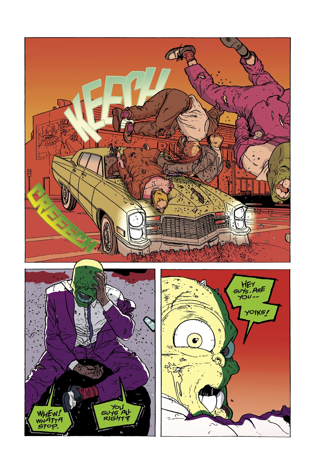
 Mask War Page 1 (2012)
Now I wouldn't have done this ordinarily, but I thought for change it might be a good idea to show the original page that was done for my Digital Coloring class at SCAD Atlanta and the new page that was done to simply practice coloring. This was the first page of the comic entitled Mask War, and it was part of the three page coloring project when I took Digital Coloring over a year ago. This was the painting project, which meant we were using brushes to color in Photoshop, and finally I got to use my Wacom Intuos3 pen. I loved using that pen, but frankly, my painting sucked. So after I redid the Dusty Star pages I knew that I would go back and fix these pages, but I don't have a tablet to make the painting easier. Therefore, I was going postpone it until I got one, but then one day I just decided to screw that idea and go ahead and re-color the three pages. I had thought about just focusing on storytelling and forget about the painting, but I changed my mind. Painting with a mouse isn't the easiest thing to do, but I think that I improved a little.

I actually wanted the Mask to wear a yellow suit like he did in the movie and some of the comics, but when the decision came to make the background in the first panel yellow as if a light bulb just went off in his head I had to go with a different suit color.

Mask War Page 2 (2011)
Mask War Page 2 (2012)
  This page was interesting to redo because when I was working on it I thought that it was a failure. I was afraid it might be too close to the original, but then I compared it. Wow! It's different. My Digital Coloring professor, Nolan Woodard had told me to lighten my darks, and I certainly did that. It looks a lot brighter, but would that keep the eye going to where I wanted it to especially in the first panel. It wasn't until I was rendering the fire and adding color holds to it that I saw that the fire would be leading the eye to the car.

Mask War Page 3 (2011)
Mask War Page 3 (2012)
I loved redoing this page, and in fact, the moment I started re-working the three pages this was the only page that I knew what I wanted. It was going to be brighter than any of the others because of the sheer impact. Though you all can help with a dilemma. My mom saw this page, and she felt that it might be better if the three thugs who are killed should be in cool colors in the first panel because they're dead. The objective for that first panel was to show the huge impact of the crash. The viewer shouldn't know that the thugs are dead until the Mask realizes it in the last panel. What do you think? Should the thugs be a cool color in that first panel?

I am a lot happier with the new version. I still need to work on the painting aspect, I think, but it's not bad considering it was all done on a mouse.

X-MEN Page

X-Men Page
Well, I actually finished coloring this X-Men page before I started redoing the Mask pages, but I felt that the three-page project should be displayed first in this entry. I really loved working on this page. It was just so fun to do. Like the Dusty Star pages before it, I actually tried something new, and that was using gradients for the shadows on the characters. I don't know if it improved the coloring any or even the characters, and so I'll let you all be the judge of that.

I had actually gotten started on flatting another X-Men page, but then I ran into a roadblock. There was something in the sky that I wasn't certain what it was. If it was the sky then I would just use the same colors I used here, but...there was a black area above it with white dots within, making it seem like THAT was the sky. So what in the world is the other? I just don't know.

Maquette Update


So the Vampire Mouse maquette is starting to look more like himself...his villain self that is. I really like how it is coming out so far. It is a whole lot better than my first maquette. Now that the SCAD Atlanta Animation Society meetings are over this quarter I am slowly defining his body and getting rid of any unnecessary clay, and then I'll be able to clothe him. When the meetings start back up in the winter I'll be able to add the fur texture to his face, something that's not really seen in the comic, but I want it on his maquette anyway.

Final Thoughts

So the fall quarter is over, and that means that work on the ANIJAM project will be starting back up...well, not for me anyway. Unless the producers of the film want me to do more work my section of the film is done and was already sent off. I am simply just waiting for the rest of the animators to finish.

SCAD wants me to donate a piece of artwork to their scholarship gala again, but I am not certain if I will since I don't have anything. However, I am considering creating a whole new piece, and there's only one that I was thinking about, which is entitled America Burns While Democrats and Republicans Fight. My reasoning is that I wasn't going to make prints of it to sell, and so why not donate it. It would be a one of a kind. Though I think that I will give it to the scholarship gala here in Atlanta instead of Savannah like the last time.

Well, I hope that all of you no matter where you are in the world have a Happy Thanksgiving. Until next time, this is Billy Wright wishing you all a good night. So long, everybody!


Sunday, November 4, 2012

Breaking Free of the Self Imposed Handcuffs!!!

 
Original Line Art
Flats

In January of 2012 I was in the Visual Storytelling 1 class when classmate, Brian Traynor (another name to remember, everybody) mentioned that there was an artist on deviantART who was looking for a colorist to color his X-Men pages. The artist wanted people to color one or more pages and send them to him via link, and then he would choose who would be the colorist. It was intriguing, and since I had just had Digital Coloring and Lettering the previous quarter I decided to do it. It was doubtful that I would be chosen, but it would be good practice all the same. Brian posted the deviantART link on the Temple of Cartoon Mojo Facebook page, and I downloaded all four pages.

I was feeling very ambitious at the time because I was thinking about coloring all four pages. Anybody can color one page, but if you go OVER the requirement you're more likely to be noticed. Unfortunately, I got so swamped with the Environments class and working on my final project in Vis. 1 that I never got around to coloring the pages. So the four pages just sat in my computer taking up space...until this week.

I have not colored a comic page since redoing the two Dusty Star pages that I had this huge urge to color a page. I remembered that I still had these pages that I thought I would finally color them. I can't send them to the artist, Jorge Molina Manzanero (also known as ZurdoM), but it would be good practice.

I chose to work on page 4 of X-Men #16 since it is kind of a slow page while the others are more action packed, and right now I have just finished doing the flats. So while I was doing this I learned something that I didn't know. It has been a while since I've picked up a Fantastic Four comic, and so the image in my head in regards to their costumes was that they are dressed in blue, a cool color. I figured that with Dr. Doom, the Fantastic Four, and Cyclops I have a bunch of cool colored costumes to deal with making it difficult to get them to pop. DC colorists do it well with Batman, but I haven't figured it out yet. However, it turns out that the Fantastic Four changed their costumes after the Human Torch died. Now they've gone white, and I am not too crazy about them, but at least it makes them easier to get them to pop off of the page. So that just leaves Doom and Cyclops as my popping challenge.

When I was taking Digital Coloring last year I had handcuffed myself, figuratively speaking, to reality. That I had thought that the background colors need to be based off of reality. Sure that thought worked well in my final project in that class where I used local color for the first two pages, but then the third page, the most powerful, I abandoned it. However, that's not going to cut it if I continue leaning towards wanting to become a colorist. Fortunately, I have been slowly breaking free from those handcuffs. This page has been very invigorating to work on because I have no idea what planet this takes place on. Is it Earth? Or somewhere else? Since I have no idea I can do anything I want to create focus. This is probably the perfect way to get rid of thinking about local color.

If you're interested in seeing more of Jorge Molina Manzanero's work, here's the link to his deviantART page: http://zurdom.deviantart.com/

Art History Day 

Art History Day in the Hub

So Tuesday, October 30, 2012 was Art History Day at SCAD Atlanta presented by the Atlanta Art History Society. The idea for this day came when I failed to get the club invited to the Embark Embrace and Discover event at SCAD Atlanta, which is basically a major/club fair. It is the perfect place to recruit new members especially Freshmen. So we needed another way to let the student body know that we exist, and not just exist, but show them that art history can be fun. I was willing to just set up in the Hub with an art history trivia challenge while also serving students a slice of a giant cookie, but Abagael Warnars, the AAHS Vice President, had a much better idea. All clubs are allowed to request funds for a catered event. Abby thought that we should do that and serve Thai food based on the Conceptual artwork of Rirkrit Tiravanijia, where eating the food and socializing with others was part of the art. It was perfect! It would accomplish the two things that I wanted most of all: new members and making art history fun.

It was an up and down process, but we were finally able to get the event put together, and it was a HUGE success. We served the following foods and refreshment:


Classic Thai Mango Sticky Rice Dessert
Green Curry
Chicken Pad Thai
 
Thai Heavenly Pineapple Fried Rice

Thai Style Iced Coffee
 
We had enough food to feed 20 people, but the idea was to allow one dish per person to stretch the food out. Though when I saw how much food we had I decided to throw that idea out the window, and instead we gave people small portions of each dish. It worked out well. We had at least over 50 people show up for the event. We ran out of plates before we ran out of food, and I had to get more plates once, but those ran out too. When the crowds began slimming down we had to find other ways to serve our guests. So near the end some guests got a carry out box from the cafeteria for us to put the Thai in or, in the case of the Chicken Pad Thai when that was all that was left, we put it in the plastic cups that were meant for coffee.

Everybody certainly seemed like they enjoyed themselves. Best of all, we added ten new people to the email list. Of course, I would be amiss if I didn't mention this, but I owe A LOT of the success in the day to Abagael Warnars and Melody Ledford. They did a FANTASTIC job!!!! Abby was stationed at the AAHS table signing people up and handling the art history trivia challenge and Melody helped me serve the food. So if either of them are reading this, I would just like to say, "Thank you! I couldn't have done it without either of you!" 


High Museum Field Trip

After the success Art History Day, the Atlanta Art History Society went on a field trip to the High Museum of Art in Atlanta for their Fast Forward: Modern Moments 1913<<2013 exhibit on Saturday, November 3rd. The exhibit is in collaboration with the  Museum of Modern Art in New York, and it features 130 works of art, and it is split into key moments in time (1913, 1929, 1950, 1961, 1988, and 2013). This field trip was supposed to happen last month, but no one showed up, and so I had to reschedule it. It was still a small group, a group of two, but it was something. Unfortunately, I really can't say that I had fun. Last year's field trip was FUN. There was a Pollock painting there, and I couldn't help but smile in remembering what Lisa Tolbert had said last year about Pollock's paintings. The drips were from all of the murders he had committed. And that would inspire us to write a fictional story about the artists we saw, and I was planning on surprising everybody with that same task this time around to be done over the break, but didn't have enough participates.

Although I can't say that I had fun it WAS still nice to see some of the artworks and artists who I had studied in the 20th Century Art class. Umberto Boccioni's Continuity of Form and Space was there, and it's a strange sculpture because it doesn't look like much, but it is very eye catching. The exhibit featured a piece from Kenneth Noland that looked like a target, but every time I looked at it I began getting dizzy. Jasper John had a sculpture there featuring a topless woman hugging the Pink Panther. You've got love it when an artist outside of sequential and animation uses a cartoon character in their artwork. Other notable artists that were featured were Mark Rothko, Salvador Dali, Georgia O'Keefe, Roy Lichtenstein, Yves Klein, Henri Matisse, and Pablo Picasso.

It is definitely worth a visit if you love art and you're in the Atlanta area.

Final Thoughts

I  am hoping that I'll have something to show of the maquette next time. Last week's maquette workshop had to be canceled, and so I don't know when it will be rescheduled. It could be this Wednesday or it could in the Winter Quarter. I can tell you that the armature is firmly bolted in the base now. 

Well, I better get back to coloring. Until next time this is Billy Wright wishing you all a good night! So long, everybody!