Sunday, November 18, 2012

"Lighten your Darks"

 Mask War Page 1 (2011)
 Mask War Page 1 (2012)
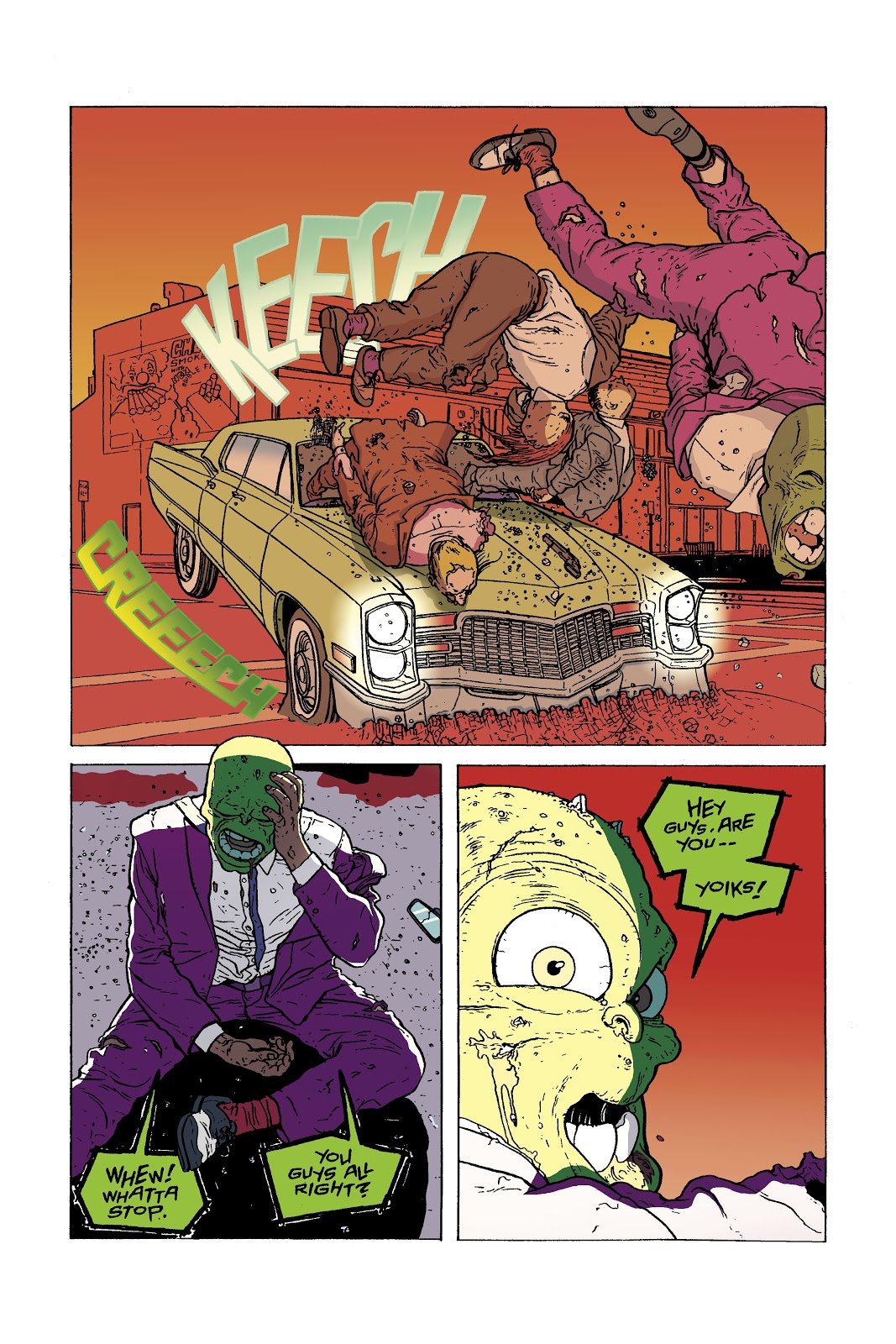
Now I wouldn't have done this ordinarily, but I thought for change it might be a good idea to show the original page that was done for my Digital Coloring class at SCAD Atlanta and the new page that was done to simply practice coloring. This was the first page of the comic entitled Mask War, and it was part of the three page coloring project when I took Digital Coloring over a year ago. This was the painting project, which meant we were using brushes to color in Photoshop, and finally I got to use my Wacom Intuos3 pen. I loved using that pen, but frankly, my painting sucked. So after I redid the Dusty Star pages I knew that I would go back and fix these pages, but I don't have a tablet to make the painting easier. Therefore, I was going postpone it until I got one, but then one day I just decided to screw that idea and go ahead and re-color the three pages. I had thought about just focusing on storytelling and forget about the painting, but I changed my mind. Painting with a mouse isn't the easiest thing to do, but I think that I improved a little.

I actually wanted the Mask to wear a yellow suit like he did in the movie and some of the comics, but when the decision came to make the background in the first panel yellow as if a light bulb just went off in his head I had to go with a different suit color.

Mask War Page 2 (2011)
Mask War Page 2 (2012)
  This page was interesting to redo because when I was working on it I thought that it was a failure. I was afraid it might be too close to the original, but then I compared it. Wow! It's different. My Digital Coloring professor, Nolan Woodard had told me to lighten my darks, and I certainly did that. It looks a lot brighter, but would that keep the eye going to where I wanted it to especially in the first panel. It wasn't until I was rendering the fire and adding color holds to it that I saw that the fire would be leading the eye to the car.

Mask War Page 3 (2011)
Mask War Page 3 (2012)
I loved redoing this page, and in fact, the moment I started re-working the three pages this was the only page that I knew what I wanted. It was going to be brighter than any of the others because of the sheer impact. Though you all can help with a dilemma. My mom saw this page, and she felt that it might be better if the three thugs who are killed should be in cool colors in the first panel because they're dead. The objective for that first panel was to show the huge impact of the crash. The viewer shouldn't know that the thugs are dead until the Mask realizes it in the last panel. What do you think? Should the thugs be a cool color in that first panel?

I am a lot happier with the new version. I still need to work on the painting aspect, I think, but it's not bad considering it was all done on a mouse.

X-MEN Page

X-Men Page
Well, I actually finished coloring this X-Men page before I started redoing the Mask pages, but I felt that the three-page project should be displayed first in this entry. I really loved working on this page. It was just so fun to do. Like the Dusty Star pages before it, I actually tried something new, and that was using gradients for the shadows on the characters. I don't know if it improved the coloring any or even the characters, and so I'll let you all be the judge of that.

I had actually gotten started on flatting another X-Men page, but then I ran into a roadblock. There was something in the sky that I wasn't certain what it was. If it was the sky then I would just use the same colors I used here, but...there was a black area above it with white dots within, making it seem like THAT was the sky. So what in the world is the other? I just don't know.

Maquette Update


So the Vampire Mouse maquette is starting to look more like himself...his villain self that is. I really like how it is coming out so far. It is a whole lot better than my first maquette. Now that the SCAD Atlanta Animation Society meetings are over this quarter I am slowly defining his body and getting rid of any unnecessary clay, and then I'll be able to clothe him. When the meetings start back up in the winter I'll be able to add the fur texture to his face, something that's not really seen in the comic, but I want it on his maquette anyway.

Final Thoughts

So the fall quarter is over, and that means that work on the ANIJAM project will be starting back up...well, not for me anyway. Unless the producers of the film want me to do more work my section of the film is done and was already sent off. I am simply just waiting for the rest of the animators to finish.

SCAD wants me to donate a piece of artwork to their scholarship gala again, but I am not certain if I will since I don't have anything. However, I am considering creating a whole new piece, and there's only one that I was thinking about, which is entitled America Burns While Democrats and Republicans Fight. My reasoning is that I wasn't going to make prints of it to sell, and so why not donate it. It would be a one of a kind. Though I think that I will give it to the scholarship gala here in Atlanta instead of Savannah like the last time.

Well, I hope that all of you no matter where you are in the world have a Happy Thanksgiving. Until next time, this is Billy Wright wishing you all a good night. So long, everybody!


Sunday, November 4, 2012

Breaking Free of the Self Imposed Handcuffs!!!

 
Original Line Art
Flats

In January of 2012 I was in the Visual Storytelling 1 class when classmate, Brian Traynor (another name to remember, everybody) mentioned that there was an artist on deviantART who was looking for a colorist to color his X-Men pages. The artist wanted people to color one or more pages and send them to him via link, and then he would choose who would be the colorist. It was intriguing, and since I had just had Digital Coloring and Lettering the previous quarter I decided to do it. It was doubtful that I would be chosen, but it would be good practice all the same. Brian posted the deviantART link on the Temple of Cartoon Mojo Facebook page, and I downloaded all four pages.

I was feeling very ambitious at the time because I was thinking about coloring all four pages. Anybody can color one page, but if you go OVER the requirement you're more likely to be noticed. Unfortunately, I got so swamped with the Environments class and working on my final project in Vis. 1 that I never got around to coloring the pages. So the four pages just sat in my computer taking up space...until this week.

I have not colored a comic page since redoing the two Dusty Star pages that I had this huge urge to color a page. I remembered that I still had these pages that I thought I would finally color them. I can't send them to the artist, Jorge Molina Manzanero (also known as ZurdoM), but it would be good practice.

I chose to work on page 4 of X-Men #16 since it is kind of a slow page while the others are more action packed, and right now I have just finished doing the flats. So while I was doing this I learned something that I didn't know. It has been a while since I've picked up a Fantastic Four comic, and so the image in my head in regards to their costumes was that they are dressed in blue, a cool color. I figured that with Dr. Doom, the Fantastic Four, and Cyclops I have a bunch of cool colored costumes to deal with making it difficult to get them to pop. DC colorists do it well with Batman, but I haven't figured it out yet. However, it turns out that the Fantastic Four changed their costumes after the Human Torch died. Now they've gone white, and I am not too crazy about them, but at least it makes them easier to get them to pop off of the page. So that just leaves Doom and Cyclops as my popping challenge.

When I was taking Digital Coloring last year I had handcuffed myself, figuratively speaking, to reality. That I had thought that the background colors need to be based off of reality. Sure that thought worked well in my final project in that class where I used local color for the first two pages, but then the third page, the most powerful, I abandoned it. However, that's not going to cut it if I continue leaning towards wanting to become a colorist. Fortunately, I have been slowly breaking free from those handcuffs. This page has been very invigorating to work on because I have no idea what planet this takes place on. Is it Earth? Or somewhere else? Since I have no idea I can do anything I want to create focus. This is probably the perfect way to get rid of thinking about local color.

If you're interested in seeing more of Jorge Molina Manzanero's work, here's the link to his deviantART page: http://zurdom.deviantart.com/

Art History Day 

Art History Day in the Hub

So Tuesday, October 30, 2012 was Art History Day at SCAD Atlanta presented by the Atlanta Art History Society. The idea for this day came when I failed to get the club invited to the Embark Embrace and Discover event at SCAD Atlanta, which is basically a major/club fair. It is the perfect place to recruit new members especially Freshmen. So we needed another way to let the student body know that we exist, and not just exist, but show them that art history can be fun. I was willing to just set up in the Hub with an art history trivia challenge while also serving students a slice of a giant cookie, but Abagael Warnars, the AAHS Vice President, had a much better idea. All clubs are allowed to request funds for a catered event. Abby thought that we should do that and serve Thai food based on the Conceptual artwork of Rirkrit Tiravanijia, where eating the food and socializing with others was part of the art. It was perfect! It would accomplish the two things that I wanted most of all: new members and making art history fun.

It was an up and down process, but we were finally able to get the event put together, and it was a HUGE success. We served the following foods and refreshment:


Classic Thai Mango Sticky Rice Dessert
Green Curry
Chicken Pad Thai
 
Thai Heavenly Pineapple Fried Rice

Thai Style Iced Coffee
 
We had enough food to feed 20 people, but the idea was to allow one dish per person to stretch the food out. Though when I saw how much food we had I decided to throw that idea out the window, and instead we gave people small portions of each dish. It worked out well. We had at least over 50 people show up for the event. We ran out of plates before we ran out of food, and I had to get more plates once, but those ran out too. When the crowds began slimming down we had to find other ways to serve our guests. So near the end some guests got a carry out box from the cafeteria for us to put the Thai in or, in the case of the Chicken Pad Thai when that was all that was left, we put it in the plastic cups that were meant for coffee.

Everybody certainly seemed like they enjoyed themselves. Best of all, we added ten new people to the email list. Of course, I would be amiss if I didn't mention this, but I owe A LOT of the success in the day to Abagael Warnars and Melody Ledford. They did a FANTASTIC job!!!! Abby was stationed at the AAHS table signing people up and handling the art history trivia challenge and Melody helped me serve the food. So if either of them are reading this, I would just like to say, "Thank you! I couldn't have done it without either of you!" 


High Museum Field Trip

After the success Art History Day, the Atlanta Art History Society went on a field trip to the High Museum of Art in Atlanta for their Fast Forward: Modern Moments 1913<<2013 exhibit on Saturday, November 3rd. The exhibit is in collaboration with the  Museum of Modern Art in New York, and it features 130 works of art, and it is split into key moments in time (1913, 1929, 1950, 1961, 1988, and 2013). This field trip was supposed to happen last month, but no one showed up, and so I had to reschedule it. It was still a small group, a group of two, but it was something. Unfortunately, I really can't say that I had fun. Last year's field trip was FUN. There was a Pollock painting there, and I couldn't help but smile in remembering what Lisa Tolbert had said last year about Pollock's paintings. The drips were from all of the murders he had committed. And that would inspire us to write a fictional story about the artists we saw, and I was planning on surprising everybody with that same task this time around to be done over the break, but didn't have enough participates.

Although I can't say that I had fun it WAS still nice to see some of the artworks and artists who I had studied in the 20th Century Art class. Umberto Boccioni's Continuity of Form and Space was there, and it's a strange sculpture because it doesn't look like much, but it is very eye catching. The exhibit featured a piece from Kenneth Noland that looked like a target, but every time I looked at it I began getting dizzy. Jasper John had a sculpture there featuring a topless woman hugging the Pink Panther. You've got love it when an artist outside of sequential and animation uses a cartoon character in their artwork. Other notable artists that were featured were Mark Rothko, Salvador Dali, Georgia O'Keefe, Roy Lichtenstein, Yves Klein, Henri Matisse, and Pablo Picasso.

It is definitely worth a visit if you love art and you're in the Atlanta area.

Final Thoughts

I  am hoping that I'll have something to show of the maquette next time. Last week's maquette workshop had to be canceled, and so I don't know when it will be rescheduled. It could be this Wednesday or it could in the Winter Quarter. I can tell you that the armature is firmly bolted in the base now. 

Well, I better get back to coloring. Until next time this is Billy Wright wishing you all a good night! So long, everybody!  
 

Saturday, October 27, 2012

Constructing the 70s


Victoria McDonald's Apartment_Shot 1_Blocking


Victoria McDonald's Apartment_Shot 2_Blocking

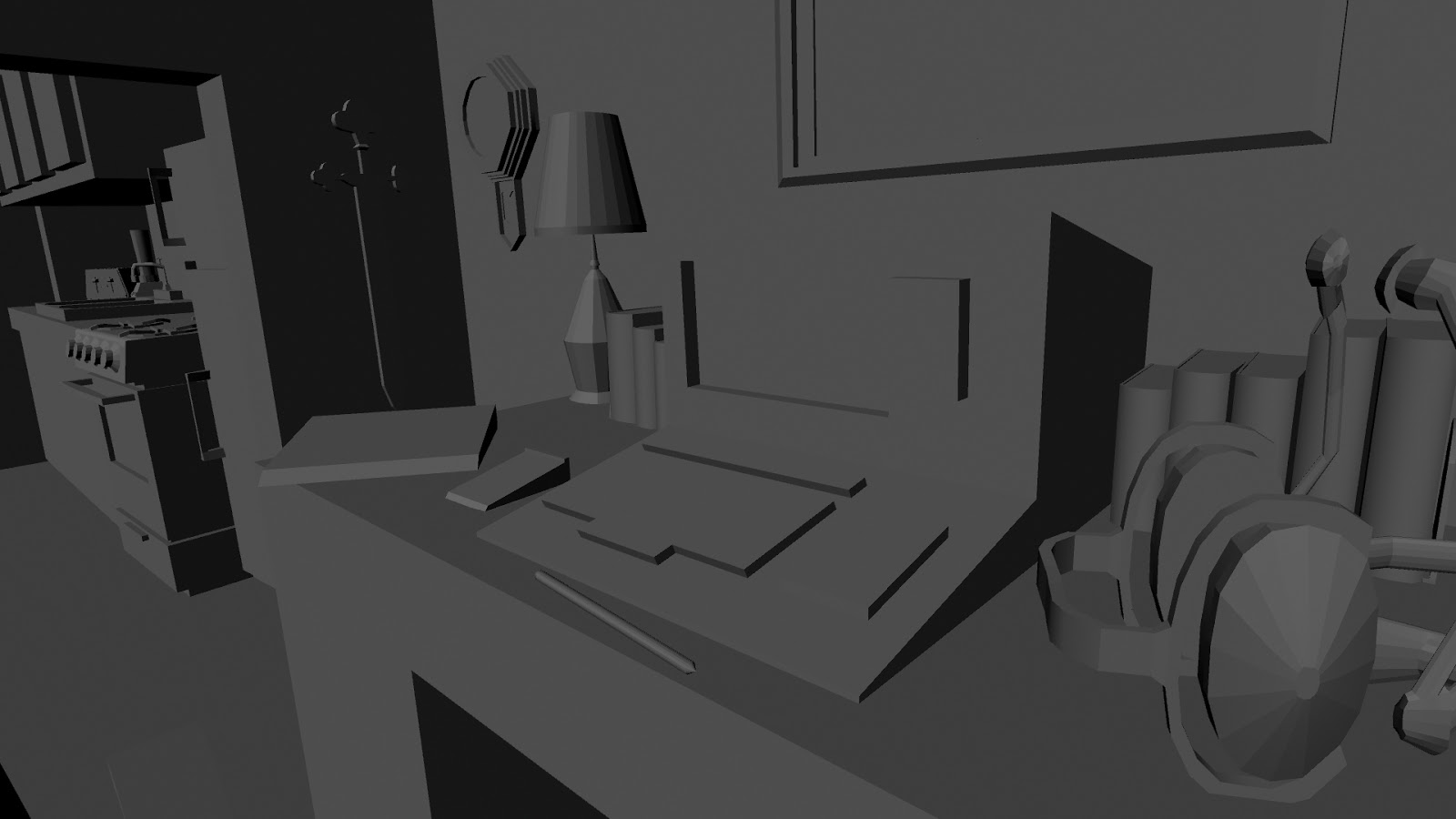
So it had really been a while since I delved into Maya. I made a book for the Atlanta Art History Society Sign Up Sheet, which ironically was never used, but I really wanted to do more. The problem was I didn't really have any ideas. I thought about perhaps staying on the Harry Potter theme since I did want to do more Harry Potter drawings, and so maybe creating Voldemort's environment, which would have included his horcruxes. As enticing as that thought was I came up with another idea. I decided to create the living room at Victoria McDonald's apartment from the Dragon stories that I have written. When the Dragon isn't patrolling the streets and skies of Gothpolis he is hanging here at Victoria's apartment since this is mission control. Victoria is like Oracle or Chloe Sullivan, she keeps an eye out for trouble with her computer and alerts the Dragon to them.

What made this room intriguing was that the stories take place in the late 70s to mid-80s although these two shots are particularly taken in the late 70s. That meant that I had to do a little bit of research on some of the items that I wanted. At first, I was only going to do the research in the modeling stage and ignore it in the blocking stage, but when I needed to build the lava lamps for shot 2 I pretty much used research the rest of the way. Aside from looking stuff up on the Internet I also sought help from my mom since she actually lived through the 70s.

Although I chose random items to populate the space there is one item in each shot that was not random. The items are actually mentioned in the stories. Shot 1 includes Madam Knight's sword hanging on the wall, and Shot 2 includes Victoria's locket on the coffee table. The locket will actually be the focus in Shot 2, but I am leaning towards the computer being the focus in Shot 1 since it tells more about her character than the sword.

Interesting fact, this is a real apartment living room. It's construction is based on my brother's first apartment in Lynchburg, Virginia, and even if the placement of the furniture is similar. That apartment is so instilled in my head that I tend to use it a lot.

Maquette #2


The Vampire Mouse Turnaround

The SCAD Atlanta Animation Society is presenting a three part Maquette Workshop, and it is being taught by Prof. Maloney, who I learned last Wednesday  taught Sequential Professors Shawn Crystal, Nolan Woodard, and Chris Schweizer how to build maquettes. How interesting is THAT?! He is considered the master of maquettes at SCAD Atlanta. My first maquette sucked in my opinion, and so I was definitely taking part in this just for a second chance. The best part of all is that this is being done in a club, and so there's no need to worry about grading. The only pressure will be within myself, which is considerable.

I knew going into this that I wanted to create the Vampire Mouse, but it has to be the villain version since I really wanted to build that cape. Vincent doesn't get his cape until he embraces the dark side, unfortunately. So no shy vampire. Maybe next time. I created the turnaround for the Vampire Mouse, but I was going to run into a slight problem after it was all inked. He needed to be colored, and since he was created in a black and white comic I never came up with a color scheme for his fur during his creation. After looking at some pictures of actual mice (ugh!) I decided to use the same color that I had used for Jerry in It All Started with a Mouse.

It looks pretty good although I realized that I made a mistake that I will have to rectify during sculpting and coloring of the maquette. I didn't draw his ring since I haven't figured out what finger it would be on if he has only four fingers. That needed to be there to create color continuity. The rule is that if you use a color like red on one piece then that same color should be used on another piece. Yellow is the only color that doesn't repeat itself, and the ring would have fixed that.

The Vampire Mouse Armature
 
 So last Wednesday we only created the armature of our character although I actually finished mine last night since I had a lot of trouble in the beginning. It started with the fact that I didn't have the right Epoxy Putty, my brand was, as Prof. Maloney put it, "inferior." Then I had to dismantle my first attempt, but that was my own decision. Prof. Maloney had mentioned that we needed to cut off the tail of the maquette unless our character has a tail. Oh, dear, I thought. My character not only has a tail, but it is rather long, and my first attempt wasn't long at all. I thought that the tail was would be created with just Super Sculpey, but no. So I had to start over to create a longer tail.

I still need to drill two holes in the base and bolt him down, but since I don't have the necessary drill bit I'll have to wait until this Wednesday. Right now I like how it is coming along, but I shouldn't read too much into that because I liked Elisha Grayson when he was just an armature too. 

Final Thoughts

So I finally finished my section of the ANIJAM project although I still need to record the voice of the dog, but I am a bit hesitate to make that appointment with the prospect of being cut from the film. I just think that it would be a waste of time to record the voice for a cut section. I would rather have more assurance that my section won't be cut before the voice recording.

Next week, the Atlanta Art History Society is going on a field trip to the High Museum of Art Atlanta to go through their Fast Forward exhibit. So I'll let you all know what I think of it.

So until next time this is Billy Wright, wishing you all a good night. So long, everybody!

Saturday, October 6, 2012

The Captains of Heroism

The Captains of Heroism

FINALLY!!! I have been keeping the identity of the fifth captain a secret for the longest time, and it is great to be able to get that off my chest. Yes, that is Captain Caveman standing among Captain America, Captain Marvel, Captain Atom, and Captain Planet. Not exactly the type of superhero you would see standing alongside those greats, but IT IS the type of character that I would draw. Truly Captain Caveman is my favorite of this drawing. Sadly, however, this was the last drawing of a Hanna-Barbera character that I will do for a while. I will eventually do more Hanna-Barbera characters, but it will be more show based instead of grouping shows together. I just want to take a break from Hanna-Barbera. Disney, Warner Brothers, and comics are still waiting for their moment in the sun, and I should give it to them. 

The funny thing about this drawing other than seeing Captain Caveman standing there with those superheroes was that he was the one who inspired this drawing. I don't remember how I started thinking this exactly except one night I was lying in bed when I began thinking about how many superheroes include a captains title. When I thought about Captain Caveman the idea for the drawing fell into place. I actually had an idea for a Captain Planet drawing that would feature his Planeteers too, but I couldn't make up my mind on how it should look. So when I came up with this idea I scraped the planned Captain Planet drawing in favor of this.

It was a lot of fun working on these character, but I had some trouble with figuring out the background. I didn't want the characters looking as though they were floating in space, and so something had to be back there. Nothing really fancy like the backgrounds of It All Started with a Mouse and The Doo Family Portrait, but it should still be interesting looking. I thought about a flag pole with a waving American Flag, but as my mom remarked, it would be perfect with Captain Marvel and Captain America looking up at the flag, but then you have Captain Atom and Captain Planet turning their backs on the America Flag. So instead I went with a giant star. I still got my American Flag in there with using gradients to create the red, white, and blue.

I feel like there is more to do with it, but that could just be my bulldog mentality of never letting anything go talking, and so I will just move my concentration somewhere else.

Political Drawing

America Burns While Democrats and Republicans Fight

I had promised you all when I first started this blog that I would never ever discuss politics or sports unless it pertained to art. Well, this has been a rather volatile political season with dirt flying from both sides that I have grown tired of it.  Important issues are being used to gain votes and power that I have decided to do my first political drawing. It combines my love for history and my disdain for the political system...or at least those who run the political system. That it is based on the legend of Rome burning while Nero fiddles, but in this case,  America is burning while the Democrats and Republicans are fighting. The drawing will feature a donkey and an elephant boxing with the U.S. Capitol in flames, and in the foreground there are political signs with liberal points and conservative points.

It will be a rather dark drawing, and unfortunately, by doing it I have painted myself into a corner because I will have to do another political drawing. The second drawing would be much lighter, and perhaps it will feature the donkey and elephant working together to put out the flames.

Final Thought

So I met with Prof. Gregg Azzopardi last Friday, and he told me that I needed to add some in-betweens here and there in my section of the ANIJAM film. I understood what he was saying, but I just hope I can add them without having to cut the balloon sequence. So I'll get back to work on that, and I should finally have it finished by next weekend. That's good news because I have a lot of Art History events to plan.

Until next time, this is Billy Wright wishing you all a good night. So long, everybody!
 

Sunday, September 23, 2012

Coloring of the Dusty Star Pages Take 2...Actually Take 3

Dusty Star_Page 26

Dusty Star_Page 29

If you had asked me when I first started attending SCAD-Atlanta in 2008 what I wanted to do after college I would have said that I wanted to write and pencil comic book stories. In 2010 I began opening up to the possibility of becoming an animator instead. But as Nightwing told the Tim Drake Robin about his relationship with Batman in the Batman, the Animated Series episode entitled Old Wounds, "Things change." I still want to write and pencil comics or perhaps become an animator, but I am really leaning towards becoming a comic book colorist. I just love the job so much, and it is an absolute blast to do. Sure the flats are a bit tedious, but once you get past that part it reaches it's fun level. So after I finished coloring all 172 frames for my section of the ANIJAM project I decided to practice some coloring, and what better thing to go back to than the two Dusty Star pages that I had done for my Digital Coloring and Lettering class almost a year ago to the day. This time, however, things were going to be different because I have learned a lot since then.

Dusty Star is a comic book character created by Joe Pruett and Andrew Robinson, and of course, she's the one with the giant star on her shirt. This was the project that immediately followed the Fear Agent project in the Digital Coloring class. The first page is very memorable for me because it is where I started becoming a faster flatter. I made a technical error by changing the size of the page accidentally, and I was already in the coloring stage when my professor and professional colorist, Nolan Woodard noticed that the linework had become skewed. I had to start all over again. I didn't make that error in the second page although I seem to remember that I came close, but for some reason something kept me from doing it. I went in to the Sequential room that following Friday during the school's 24-hour challenge, and so while everyone in the department was trying to make a complete comic in 24 hours I was working to correct my stupid mistake. I don't know why it is, but for some reason when I am angry with myself I go faster. My anger kicked me into overdrive, and not only did I finish flatting that first page that day, but I finished coloring it too. I've continued flatting, and now I can flat at least six pages in a day.

My first attempt at the two pages ended with me getting a C in the project, which was much better than what I got in my first attempt at Fear Agent. So naturally I was going to fix the problems that Nolan and the class had suggested, and then I was going to resubmit it. I finished redoing the first page, but then...came the second page. I would work on the pages before my 8 AM  Comic Book Scripting class, and the SCAD-Atlanta computers were updated with the CS5 Photoshop even though I had CS4 at home, but that has never been a problem. Illustrator will go insane, but Photoshop has never cared if a project was created on a CS4 and then transferred over to a CS5 or vice versa. I've gone back and forth between the two bunches of times without any hiccup. Then one day I tried to work on the second page on my CS4, and I get a message saying that it can't open it since it was created on an earlier version of Photoshop. Since when did it care?! I went back to the exact same computer that I was working on before the Scripting class, and I got the same message. No matter which computer I went to Photoshop refused to open the file. There was only one thing to do, and that was to start over with the flats since this was before I started saving my flats on a separate file. However, I was already working on my final project in the class, and I felt that I needed to focus my time on that instead of resubmitting this project. It frustrated me to no end especially since it would turn out that I sacrificed my chance of getting a B in the class. Aw, well, I can only shrug my shoulders and move on since it's not about grades anyway, it's about what you learn.

The coloring of the Dusty Star pages take 3 took place a few days ago, and I scrapped all of the colors that I had chosen originally for the first page. This time I had a new vision in my head for these two pages, and they focused on aerial perspective, focus, and temperature, but also making the pages look as though it was a Western comic. When I was working on these I didn't have my critique notes with me, but I did make sure that some of the suggestions that I remembered were implemented such as the dead bodies being in cool colors, making the last panel of the first page hot, and using color holds on the sound effects. Speaking of color holds though I performed an experiment that I had tried in the ANIJAM, but didn't like it in there, and so I figured that it would work out better here. I placed a color hold on some of the background in the first panel of the first page to create a sense of perspective because you wouldn't really see some of those objects that clearly. It looks pretty good. Although the blond mercenary is back there too I decided NOT to place a color hold on her because I didn't think that it would look very good on a regular person.

When both pages were done I went over them with a monochromatic color to give them a sort of Western comics look. I created a separate layer, and then I filled each panel with a yellowish brown color at 25% opacity. I did have to run several tests on the first page to see what percentage of the opacity would allow the viewer to still be able to tell what the colors underneath the fill are, and 25% was the best. The second page was actually a lot colder, but then the fill brightened it up a tad, and I think that it works better that way.

Although I am letting you all view these two pages I am not ready to print them out and place them in my color portfolio just yet. I would like to hear feedback from my friends, fellow sequential artists, and especially Nolan Woodard first. Feel free to tell me too. Any suggestions to make these better would be taken under serious consideration.

ANIJAM 2012 Update

Frame 240
I am not ready to show off the finished film yet since the ANIJAM group hasn't seen it, but here is Frame 240 of my section. The coloring took a lot longer than I had anticipated, and I was so glad that they decided to push the deadline back, which allowed me to slow down a little instead of rushing it like I was doing. When it came down to coloring the frames I had a certain vision in my head, and it was a vision that most animated colorists would not have taken, but I am not coming at this like an animated colorist. My thinking and approach to coloring will always follow the path of comic books. My inspiration for my section were the classic Hanna-Barbera cartoons, which is why I used very little shadowing on the figure except when the box was blocking a part of him, but I colored it as if I was coloring a comic book page.

Well, the ANIJAM group met at the DMC (Digital Media Center) on Friday for a private screening on the big screen, and a majority of the animation professors were there to watch it. That was great because we got to hear their opinion, but there was a downside to it because they told us that some people will have to get cut from the film. Any section that is slowing the pace of the film faces being cut, and the professors didn't exactly say who was slowing the pace. So now I have something more to worry about. However, either Prof. Maloney or Prof. Becky Wible-Searles said that while the credits are rolling we could show two seconds of the films that were cut sort of like outtakes that way the animators are still credited. I suppose, that is some sort of consolation, but I am still worried. So I have been thinking about what parts of my film could be cut to speed up the pace. Some time this week we should be meeting with Prof. Gregg Azzopardi to go through each section one by one and talk about what needs work. I'll know more after that. Hopefully nothing will require more drawing. Please let it all be fixable on the computer. 

The professors did congratulate us all because we have done a lot better on this personal project than they were expecting. Sure there were some problems, but fixable ones. We have set the bar pretty high for ourselves too. The professors are going to expect a lot from us when we get into some of the higher classes because of how we are coming along with this project. It's a great compliment and a terrific challenge, and challenges are things that I like to undertake.

Final Thoughts

I am still working on thumbnailing the second installment to the Vampire Mouse mini comic, and now that the ANIJAM is nearly complete and the Dusty Star pages are complete pending feedback I can get back to work on it. I have recently made some changes to the first installment of the comic, mainly the word balloons. I got rid of the hand lettering in favor of digital lettering, and it allowed me to put back some words that were deleted due to space. I will be taking down the original mini comic and replacing it with the special edition some time this week.

Near the end of the last quarter I was named the new President of the Atlanta Art History Society, and I officially took charge at the beginning of this quarter. I have a lot of plans in store for the club, but the main objective is to get people to continuously come to the meetings. Everyone on the board has at least five quarters or less left, and if we don't get some new people into the club it will dissolve when I leave. I don't want to see that happen.

So until next time, this is Billy Wright wishing you all a good night. So long, everybody.

Saturday, August 18, 2012

ANIJAM 2012 Pencil Test


It has been a while since I have written anything, and that's mainly because my life has been totally consumed  by the ANIJAM project that I haven't had the time. However, I am taking a couple of days to rest my mind before I start with the finishing touches. At first I wasn't going to post the animation before it is completed since until last Friday none of the animators working in the ANIJAM knew what any of the others were doing for their section of the film, and I am a big fan of keeping artwork under wraps if I think I can get a huge reaction out of the revelation of it. Even in the realm of blogging I have kept things secretive despite my promise to let you all see my art process from the thumbnail stage to the finished piece, which I still will, but not on pieces that are intended to surprise the viewer. Take the The Captains of Heroism piece that I am working on, only my mom knows who all five captains are that I am drawing. My friends and any one who reads these entries only know about Captain America, Captain Marvel, Captain Planet, and Captain Atom, but I am keeping that final captain under wraps until I am finished with the whole piece. I love surprising my audience.

Anyway about the ANIJAM, some of us from the group met at the DMC (Digital Media Center) at SCAD-Atlanta last week, and so we got to see the entire film. It looked great, and even Prof. Ingham said that it looked better than he had expected when the film only contained pencil tests. We had a few problems here and there in regards to the transitions from film to film, which sadly included mine, but no fault of my own though. When you start an ANIJAM the only transition that you have to worry about is the person in front of you. I had to make sure that there was a smooth transition from that animators film into mine, and that was spot on. There was no need to worry about what the person behind me is doing...unless they dropped out of the project, and that's what happened. So I have a new animator behind me, and he hadn't seen what my last frame was, which made the transition from my film to the next very noticeable, which is what you don't want. However, I  emailed him a few days ago, and we got everything worked out. I was willing to do the transition myself providing he gave me the last frame of the animator who dropped out, but he said that he would do it (I had sent him my last frame just in case he wanted to do it).

The version above is the revised pencil test, which included a lot of changes from not only the first pencil test, but also from the storyboard. After hearing Prof. Ingham's suggestions on how to improve the film I made a few cuts to shorten it a bit while also trying to make sure that some elements were slowed down. The first thing that was cut was the second piece of dialogue, which I am very glad I cut because it took me forever to finish the clean up/transitions on Thursday and Friday morning that I never slept. I might still be working on the film if that second piece of dialogue hadn't been cut. I got rid of the burning tree, and there were several other things that made the cutting room floor, but the tree and the second piece of dialogue were the big ones.

The drawing portion of the project is done, which I am so happy about. Next up, is the coloring. I had originally intended that there would be a 3D element in the animation, but I have decided to forego that and practice 2D/3D compositing at a later date. So it will be all 2D animation, and I am going to combine my knowledge of comic book coloring with animation, which means I will be using color holds and colors to tell the story.


I wasn't planning on doing this, but here's the original pencil test, and so you can compare it with the revised version. 

Workspaces

My Two Workspaces
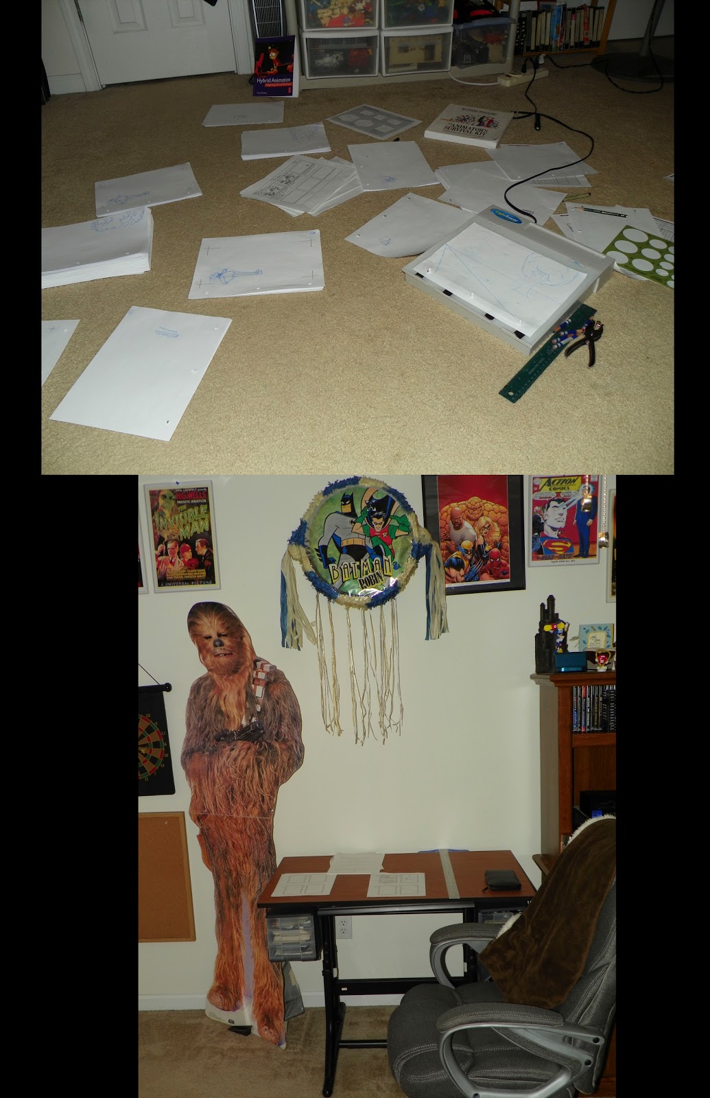
Friend and fellow Sequential Artist, Melody Ledford, another one of those artists you all need to remember for the future, posted her workspace on Facebook, and that got the Temple of Cartoon Mojo, the unofficial Sequential Art club at SCAD-Atlanta, to encourage all of us to post our workspaces. I posted mine, but I thought that it might be a good idea to show you all too. I have two areas where I do my work: the top is my animation workspace and the bottom is sequential. Both spaces are safely guarded by Chewbacca.

Final Thoughts

As I said I am taking a couple of days away from the ANIJAM to rest my mind from the stress and tension that I naturally put on myself whenever I am working on a project. So I am going to use that time to work on the second installment of the Vampire Mouse and get The Captains of Heroism out of the penciling stage.

Also, I would like to take the Vampire Mouse to another level outside of mini comics, and recently I have been thinking about web comics, but I don't know what web host would be the best to go to. If any of you have suggestions please let me know.

I doubt that I will be posting next week, and so I would like to wish my mom an early Happy Birthday.

Until next time, this is Billy Wright wishing you all a good night. So long, everybody.

Monday, July 9, 2012

Half an Animatic


This was an animatic that I did for the ANIJAM project, and actually it was the first animatic that I've ever done. It's a funny story how it's creation came about. I was planning on taking my storyboards and animating them in Flash including the voice track, and it would be like the deleted scenes on a DVD of a Disney animated feature. I felt that that would be a long time down the road, but then Prof. Keith Ingham told me that if I wanted to include dialogue in my animation that I needed to create an animatic first. Well, I had no idea what an animatic was. Prof. Schweizer briefly mentioned it in the Character Design and Storyboarding class. So I knew enough that it had something to do with the storyboards. So of course, I did the only logical thing to do when one doesn't know something...I Googled it. It turned out that an animatic was what I was planning on doing in the first place. Taking each frame and animating it, and it includes both the voice track and the sound effects. Actually I haven't decided how I want the explosion to sound like yet, and so I didn't include the effects. I guess, this is actually a half an animatic instead.


I provided the voice of the dog, and I based his voice off of the legendary voice of Astro and Scooby-Doo, Don Messick. Although right now anyone who knows me probably can tell that it's me doing the voice I can assure you no one will when the animation premieres. I plan to take the voice track and tweak it to sound totally different. If I can make Alan Reed/Fred Flintstone sound like an elf, I can make myself sound like someone else. I just want a gruffier voice for the character.


The great thing about doing this animatic was that it forced me to figure out the in-betweens while creating it. Each animation in the ANIJAM has to be at least 15 seconds, and I wasn't able to time the action like I had done in the original version that Prof. Ingham wanted me to change. The action was just too crazy to time. So I thought that I would have to cut or shorten some parts of it. However, once I figured out how many in-betweens I needed I learned that it would be just 11 seconds. I could go shorter too because there were some sequences where I gave it an extra in-between to be on the safe side, and it might turn out that those aren't needed at all.


I have finished doing the Key Frames for the animation although I will need to revise it a little. Mainly the box will need to be revised based on where the last animator left it, and I certainly hope that they didn't leave it somewhere strange, forcing me to change the character's positioning. I haven't checked my emails to see if I got the last frame of the animator before me, but if I didn't get it today then I will tomorrow.


Heroes Con 2012


Last month I went to Heroes Con, and it was my third one. I would have to say that Heroes is the best of the conventions that I've been to. I know that I've only been to Heroes Con and Dragon Con, but the latter is so crazy, not to mention that it is divided into several locations. At least Heroes is just in the Charlotte Convention Center. This year's Heroes was huge. They had a bunch of big names in the comic industry there including Stan Lee (not that I saw him), Mike Mignola (creator of Hellboy), and Paul Levitz (the former president of DC Comics). I did get to meet Mike Mignola, and frankly, the impression wasn't very good. I did get his autograph, but I suppose I decided to get it more based off of my regret with Dick Giordano. I will always cherish that handshake and the talk I had with Giordano on my first trip to Heroes in 2009, and sadly, it was his last as he would pass away the next year. My only regret was that I never got his autograph. That's why I was willing to shell out $60 to meet Stan Lee last year at Dragon Con and why I got Mike Mignola's autograph this year. Although Mignola is younger than both Giordano and Lee we don't really know when the last time we will ever meet or see anyone.


Okay, let's move on from this depressing topic and discuss something more upbeat. I really didn't do much on the first day of Heroes except take a look around at some art and buy a couple of graphic novels done by some SCAD alumni (I've got to support them). During one of my trips walking around I glanced over at this science fiction comic that was being sold at a booth in Artist's Alley, and it was just a glance, but it was enough for the woman there to call out to me. So I stopped by the booth, and she started talking about Zyo Comics' Ultimate 7. They were selling four issues as well as prints and a graphic novel that was basically all four issues put together into one. I wound up buying the first issue, and I admit that I had a bizarre reason for doing so. When she was flipping through the pages I immediately saw what appeared to be a photograph of the earth within the artwork, and both Nolan Woodard and The DC Comics Guide to Coloring and Lettering Comics say using actual photographs in a comic is an effect that colorists should avoid no matter how cool of an idea it may seem. That's why I got the comic to get a closer look and because I had never seen it done in a comic. Though just before I left the booth she told me that if I get the time to read it before the convention is over to come back and tell them what I thought. Oh, dear.


Well, I read it, and overall, I liked it. However, I found that the photographic earth was a distraction, just as Nolan and the guide book had said it would be. It was all right for the first panel on the first page because there wasn't any other artwork in that panel, but it becomes a distraction later in the issue when it's done again except this time there are drawings in the panel. The focus should be on the space ships, not the earth. That was my main criticism about it, but I really didn't have the heart to go back and tell them. I didn't want to burn any bridges when someday I may have to use that bridge. So on the second day of the convention I would head over there twice, but then turn right back around. It wasn't until I met my friend and fellow SCAD sequential student, Liz Enright (another name that you all need to remember someday), and I told her my problem. What she said gave me the courage to go over to the booth. Let the bridge fall where it may. I know that I am right, and I have two colorists who would agree.


So of course, the worse case scenario that I always imagine never happens...correction, rarely happens. I spoke with the same woman as before, and it would turn out that she was the letterer. She understood where I was coming from in regards to the photograph. I also met her husband, who was the writer and creator. So I talked to him for quite a while, and I started out as a regular comic buyer but I felt that things really changed when I told him that I really loved the color holds. He was the one who did the color holds (he also does the flats), and he was glad to meet someone who actually knew what a color hold was. After studying colorist, Alex Sinclair and taking digital coloring I have grown to love color holds, but I use them only sparingly. He uses them a lot, but at least he does so in the right places. Interesting though he told me that he goes over the ink lines very carefully, not to ruin the other colors. I found that there are several ways to color hold, but Nolan's way is the easiest and most efficient.


I would speak with them again on the final day of the convention to mainly say goodbye, and they told me to befriend them on Facebook and to let them know if I ever need a job. Wow! These are the exact reasons an up and coming comic artist goes to conventions, but it certainly is a surprise when it happens.


Final Thoughts


I started penciling The Captains of Heroism just before the Charlotte trip, but I haven't finished it yet. I still need to draw Captain America, and I am not too certain about the poses of Captain Atom and Captain Planet. I may go back to the drawing board for them. They look fine in the thumbnail stage, but they kind of lose that in the penciling. Aw, well, these little things can't be helped sometimes.


Until next time, this is Billy Wright wishing you all a good night. So long, everybody.