"Lighten your Darks"
 |
| Mask War Page 1 (2011) |
 |
| Mask War Page 1 (2012) |
Now I wouldn't have done this ordinarily, but I thought for change it might be a good idea to show the original page that was done for my Digital Coloring class at SCAD Atlanta and the new page that was done to simply practice coloring. This was the first page of the comic entitled Mask War, and it was part of the three page coloring project when I took Digital Coloring over a year ago. This was the painting project, which meant we were using brushes to color in Photoshop, and finally I got to use my Wacom Intuos3 pen. I loved using that pen, but frankly, my painting sucked. So after I redid the Dusty Star pages I knew that I would go back and fix these pages, but I don't have a tablet to make the painting easier. Therefore, I was going postpone it until I got one, but then one day I just decided to screw that idea and go ahead and re-color the three pages. I had thought about just focusing on storytelling and forget about the painting, but I changed my mind. Painting with a mouse isn't the easiest thing to do, but I think that I improved a little.
I actually wanted the Mask to wear a yellow suit like he did in the movie and some of the comics, but when the decision came to make the background in the first panel yellow as if a light bulb just went off in his head I had to go with a different suit color.
 |
| Mask War Page 2 (2011) |
 |
| Mask War Page 2 (2012) |
This page was interesting to redo because when I was working on it I thought that it was a failure. I was afraid it might be too close to the original, but then I compared it. Wow! It's different. My Digital Coloring professor, Nolan Woodard had told me to lighten my darks, and I certainly did that. It looks a lot brighter, but would that keep the eye going to where I wanted it to especially in the first panel. It wasn't until I was rendering the fire and adding color holds to it that I saw that the fire would be leading the eye to the car.
 |
| Mask War Page 3 (2011) |
 |
| Mask War Page 3 (2012) |
I loved redoing this page, and in fact, the moment I started re-working the three pages this was the only page that I knew what I wanted. It was going to be brighter than any of the others because of the sheer impact. Though you all can help with a dilemma. My mom saw this page, and she felt that it might be better if the three thugs who are killed should be in cool colors in the first panel because they're dead. The objective for that first panel was to show the huge impact of the crash. The viewer shouldn't know that the thugs are dead until the Mask realizes it in the last panel. What do you think? Should the thugs be a cool color in that first panel?
I am a lot happier with the new version. I still need to work on the painting aspect, I think, but it's not bad considering it was all done on a mouse.
X-MEN Page
 |
| X-Men Page |
Well, I actually finished coloring this X-Men page before I started redoing the Mask pages, but I felt that the three-page project should be displayed first in this entry. I really loved working on this page. It was just so fun to do. Like the Dusty Star pages before it, I actually tried something new, and that was using gradients for the shadows on the characters. I don't know if it improved the coloring any or even the characters, and so I'll let you all be the judge of that.
I had actually gotten started on flatting another X-Men page, but then I ran into a roadblock. There was something in the sky that I wasn't certain what it was. If it was the sky then I would just use the same colors I used here, but...there was a black area above it with white dots within, making it seem like THAT was the sky. So what in the world is the other? I just don't know.
Maquette Update
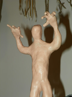
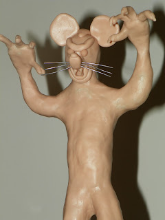
So the Vampire Mouse maquette is starting to look more like himself...his villain self that is. I really like how it is coming out so far. It is a whole lot better than my first maquette. Now that the SCAD Atlanta Animation Society meetings are over this quarter I am slowly defining his body and getting rid of any unnecessary clay, and then I'll be able to clothe him. When the meetings start back up in the winter I'll be able to add the fur texture to his face, something that's not really seen in the comic, but I want it on his maquette anyway.
Final Thoughts
So the fall quarter is over, and that means that work on the ANIJAM project will be starting back up...well, not for me anyway. Unless the producers of the film want me to do more work my section of the film is done and was already sent off. I am simply just waiting for the rest of the animators to finish.
SCAD wants me to donate a piece of artwork to their scholarship gala again, but I am not certain if I will since I don't have anything. However, I am considering creating a whole new piece, and there's only one that I was thinking about, which is entitled America Burns While Democrats and Republicans Fight. My reasoning is that I wasn't going to make prints of it to sell, and so why not donate it. It would be a one of a kind. Though I think that I will give it to the scholarship gala here in Atlanta instead of Savannah like the last time.
Well, I hope that all of you no matter where you are in the world have a Happy Thanksgiving. Until next time, this is Billy Wright wishing you all a good night. So long, everybody!


No comments:
Post a Comment